Architecture should make you feel good: A chat with filmmaker Gavin Froome
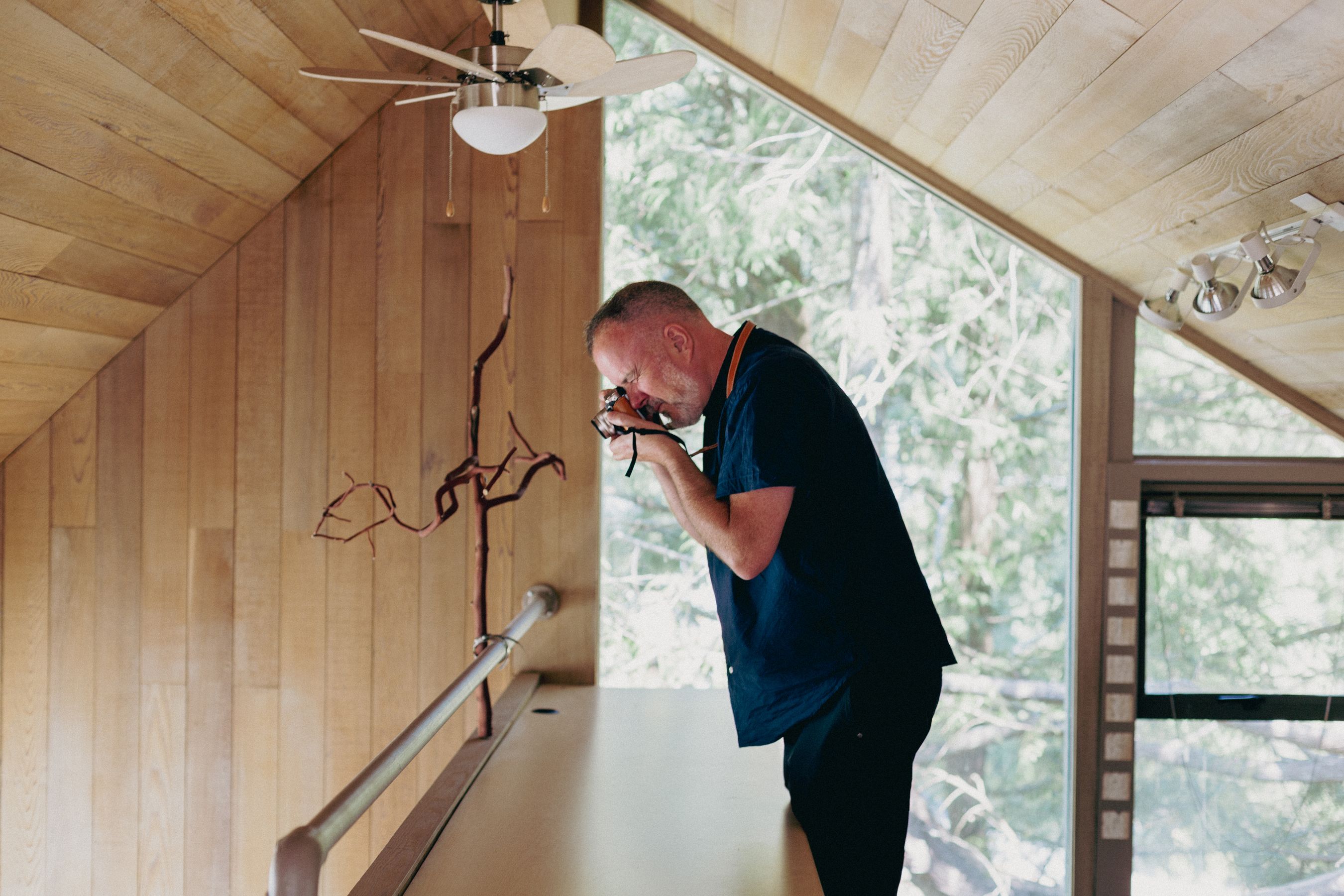
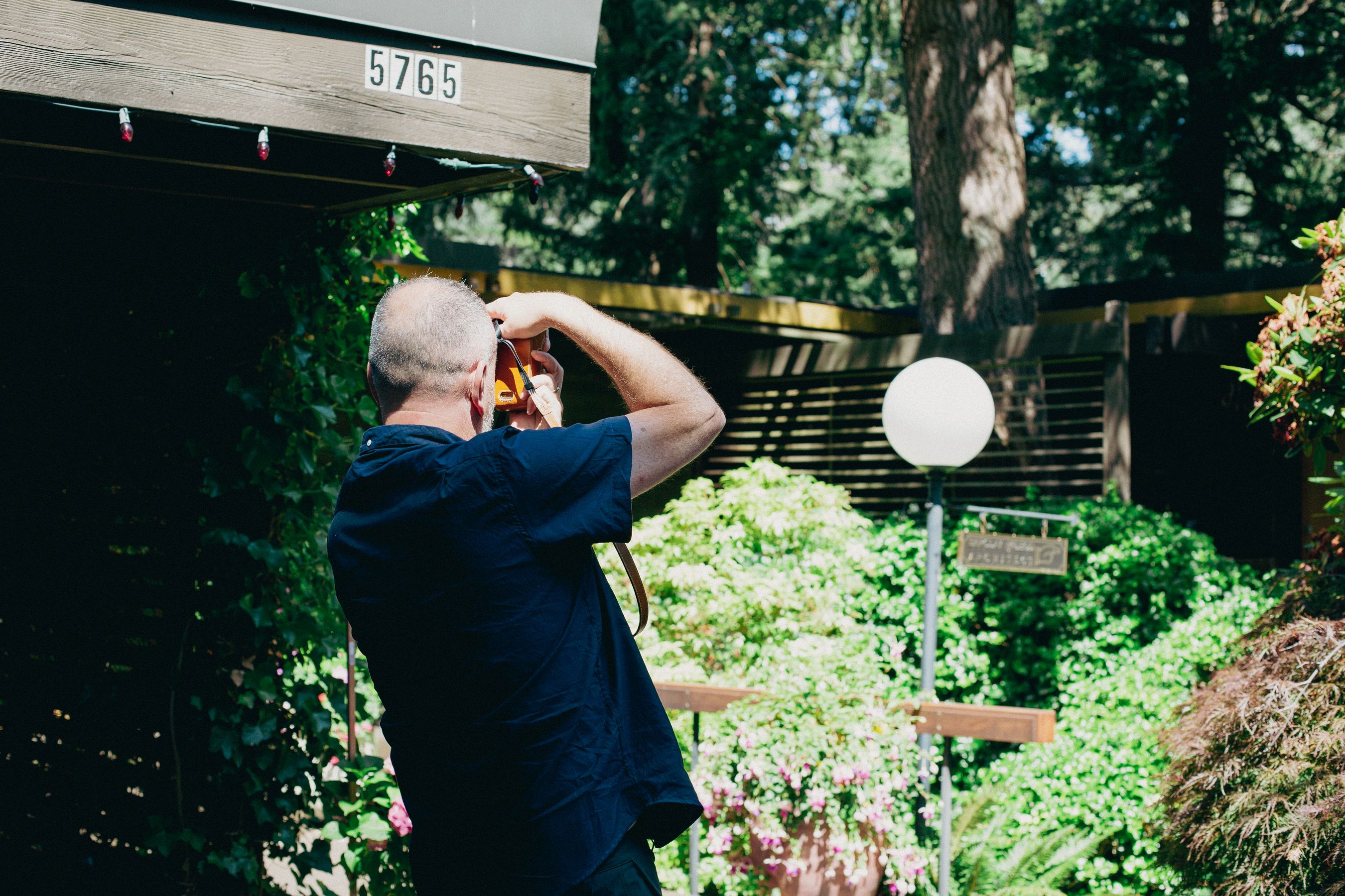
Gavin photographing The Hassell House by Robert Hassell.
Photo: Patrick Campbell
It’s a warm Tuesday morning as I sit down at Isetta Cafe in West Vancouver with filmmaker and art director Gavin Froome. It’s been 12 years since the release of his documentary “Coast Modern”, and Froome’s passion for architecture hasn’t cooled one bit. Before I can even hit record we’re deep into it.
Gavin Froome
I was reading an article in the New York Times that talked about some remarkable modernist masterpieces in France, particularly Villa Savoye and Maison De Verre. These buildings were truly radical experiments during the 1920s and 1930s, as nothing like them had been seen before in the world. The article highlighted a line that stuck with me, emphasizing that both houses were constructed in the brief period between the two World Wars, representing the high point of classical modernism. They embodied the movement's obsession with hygiene and the idea that a house could serve as a tool for physical healing. It's fascinating to think about how people nowadays are so focused on wellness, mindfulness, organic food, exercise, connection, and community—a pursuit of living to their fullest potential. Architecture plays a significant role in supporting such a lifestyle, but unfortunately, much of the built environment, especially in North America and particularly on the West Coast, lacks a solid foundation.
Patrick Campbell
I find it perplexing that someone would spend hundreds if not thousands of dollars a month on wellness, but then seemingly not care about their domestic environment.
“Even during their heyday, these houses were misunderstood, and only those who were open to new ideas and possibilities embraced them.”
GF
It seems like everything is a free-for-all, with different architectural styles from various decades coexisting.Take Vancouver, for instance, where you can see a mix of architectural styles on any given street, ranging from monster houses of the '80s to Vancouver specials from the '70s, cool modernist boxes from the '60s, charming bungalows from the '50s, and so on. There's no cohesive architectural identity or rooted tradition, making it feel like a bit of an experiment. North America as a whole is like an idea, a melting pot of cultures coming together to build a life. However, this experiment came at the expense of erasing the culture that existed here for centuries. It's unsettling to think about how we colonized and took over First Nations' territories, yet we cherish and display their art in museums. Their architecture, like longhouses and hideaways, are remarkable, utilizing regional materials in a time when importing and exporting were not as prevalent.
Despite this mishmash of cultures and influences, the fact that the postwar modern houses, with their distinct features like exposed beams and open spaces, still stand today is quite miraculous. Even during their heyday, these houses were misunderstood, and only those who were open to new ideas and possibilities embraced them. Today, with the influence of platforms like Instagram that are full of modernist design, it's still challenging to sell these unique architectural designs to the broader public. Nevertheless, the enduring presence of these houses is a testament to their enduring appeal and significance in architectural history.
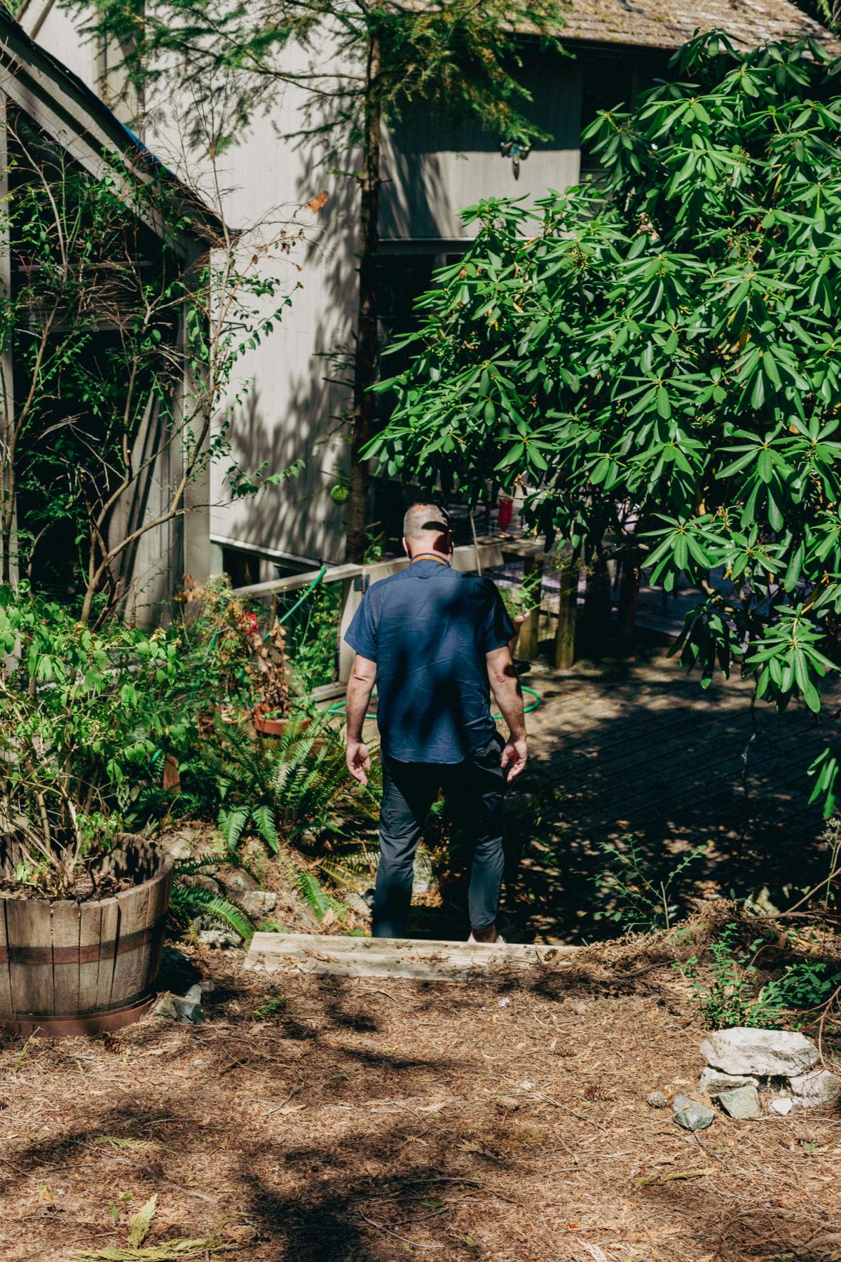
Exploring the The Hassell House's back yard.
PC
Coming back to influence, one of the most prominent figures in the world is Kim Kardashian. She has exceptional taste in design and has collaborated with renowned designers like Axel Vervoordt and Tadao Ando on her residential projects. Given her immense popularity and the number of individuals who emulate her style, I had hoped that her appreciation for design could have a more widespread impact on popular culture.
Of course, not everyone has the resources to hire a renowned architect like Tadao Ando for their home renovation. However, there is a wealth of amazing design options available that are equally if not more affordable than conventional choices.
“Media plays a vital role in shaping people's frame of reference and influencing their preferences for architectural styles.”
GF
In media like Dwell magazine and movies, we often see portrayals of luxurious and opulent houses, which can influence people's perceptions and desires in real life. For example, during the 1980s, shows like "Dallas" and "Falcon Crest" were hugely popular, and they showcased grand Greco-Roman mansions with fountains and columns. While these designs may have been appealing in Italy centuries ago, when replicated in North America during the '80s, they often resulted in unattractive structures.
As we moved into the '90s, MTV Cribs and movies like "Scarface" with Tony Montana's mansion in South Beach had a significant impact on young culture. These depictions influenced the desires of young people, leading to the creation of ostentatious and gaudy mansions. Media plays a vital role in shaping people's frame of reference and influencing their preferences for architectural styles.
PC
Interestingly, modernism is often portrayed in movies as the setting for the bad guy's office or lair. Architectural masterpieces like Frank Lloyd Wright's works or Lautner's Elrod House are frequently associated with villains in films.
GF
This portrayal of modernism as evil or cold can be attributed to conservative Christian values, where certain architectural styles were deemed suspicious or unconventional. Modernist houses, with their open and transparent designs, were met with skepticism when they first appeared. Donald Olson, a modernist architect, faced this skepticism when he built a glass box house in the Berkeley hills. People tend to be suspicious of what they are not familiar with, and since modernist houses are rare and often concealed behind lush landscaping, they remain unnoticed compared to more traditional and easily visible houses.
In traditional houses, the landscaping is usually an afterthought, while in mid-century modern houses, the landscaping is an integral part of the overall design. The emphasis on landscape design in mid-century modernism is to create layers of privacy and enhance the overall experience of the property. However, this has led to the modernist houses being hidden from view, as they are often concealed by driveways or hedges.
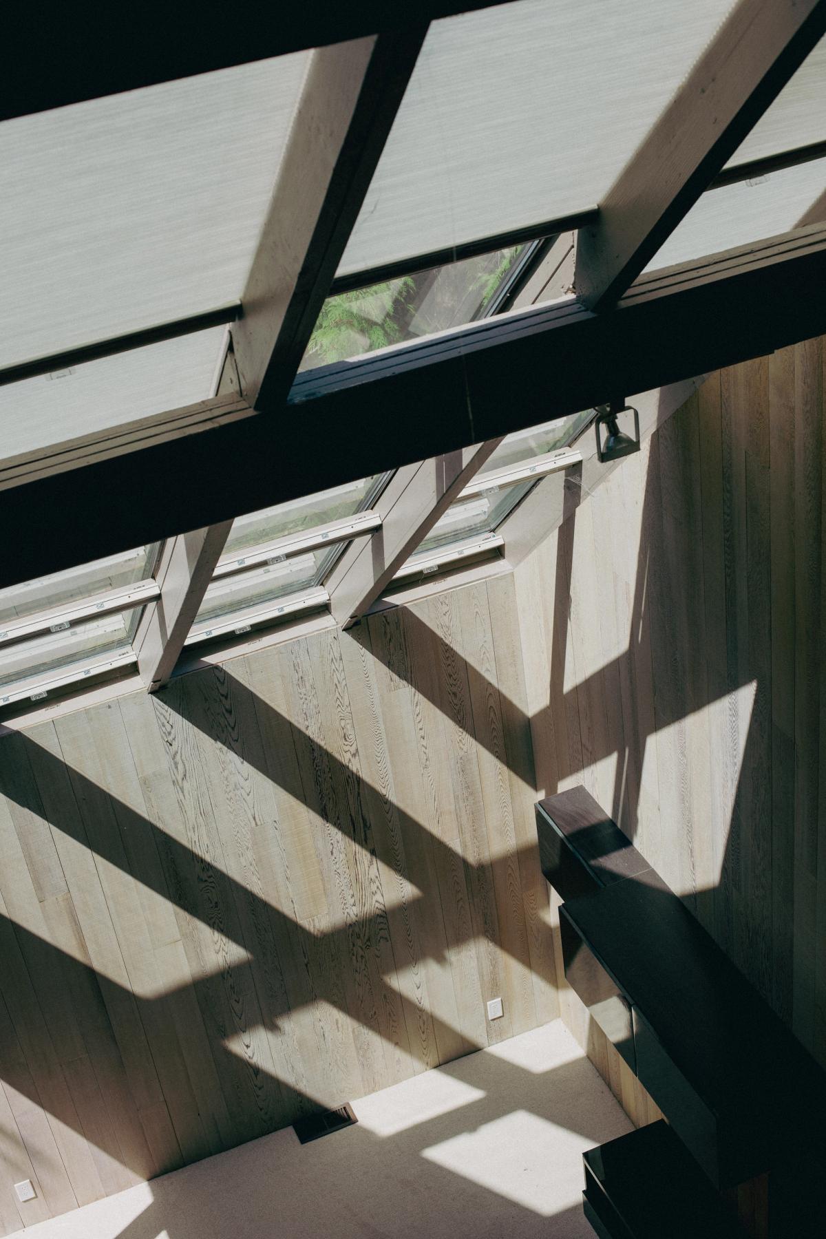
View from the top loft of the Hassell House.
PC
I agree, it’s such a shame that so much of the good stuff is hidden from public view. The amount of shrubs I’ve had to stick my head through or walls I’ve climbed over to get a better look at house. Whenever I’m in the States on an architecture pilgrimage, I have to remind myself that Americans are a bit more stringent on trespassing than Canadians. I’m always worried, “Is today the day I get shot for looking at a Richard Neutra?”
GF
As a result, the general perception of what a house should look like is often based on the traditional and grandiose houses that are prominently displayed. The intricacies and beauty of modernist houses, particularly the mid-century designs, often go unnoticed due to their discreet presence on the property. This phenomenon underscores the significant impact that media and visibility have on shaping people's architectural preferences and choices in real life.
It's interesting how the best architectural designs often go unnoticed, while generic houses dominate the landscape. The truly exceptional post and beam houses, for instance, remain hidden from view, known only to those lucky enough to experience them or be invited inside. This lack of visibility prevents many people from being exposed to the possibilities of better living through thoughtful design.
The West Coast modern tours are essential in opening people's minds to the potential of unique and well-designed spaces. Such experiences can inspire individuals to reconsider their living situations and make positive changes in their lives. Unfortunately, the current real estate market and high land prices have made building homes more expensive and challenging. In the mid-century, it was different when affordable land allowed even modest individuals to construct thoughtfully designed houses that could stand the test of time.
The prevailing trend seems to favour quick and easy fixes and upgrades, rather than investing in well-built and thoughtfully designed homes. People tend to focus on superficial aspects like granite countertops and stainless steel appliances, overlooking the importance of natural light, space layout, and overall experience. Genuine, long-lasting design can withstand changing tastes and serve generations to come.
While owning a house is a privilege, it's crucial to demand more from those who build our living spaces. Vancouver's limited selection of decent rental apartments highlights the need for better quality and design in the buildings we inhabit. Unfortunately, the disposable mindset prevalent in North American culture leads to the acceptance of lower-quality constructions and materials. Instead of consulting architects and investing in well-crafted structures, there's a tendency to opt for cheap, prefabricated options that don't stand the test of time.
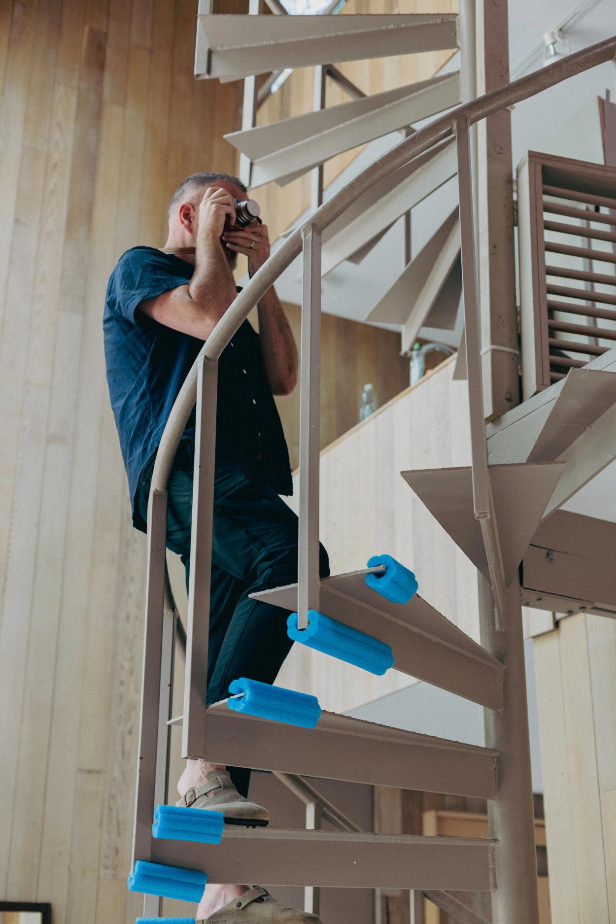
Gavin on the Hassell House's spectacular spiral staircase.
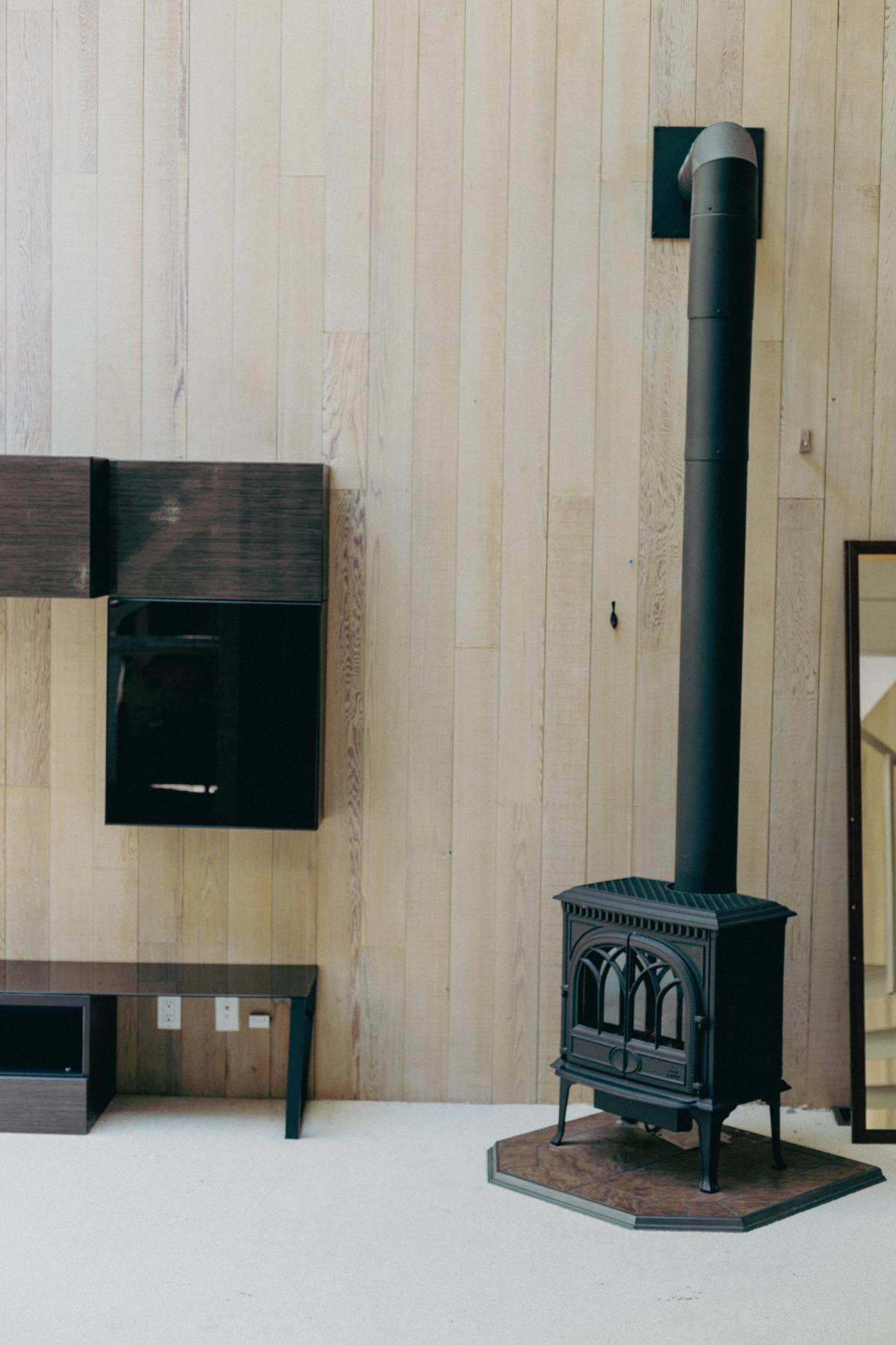
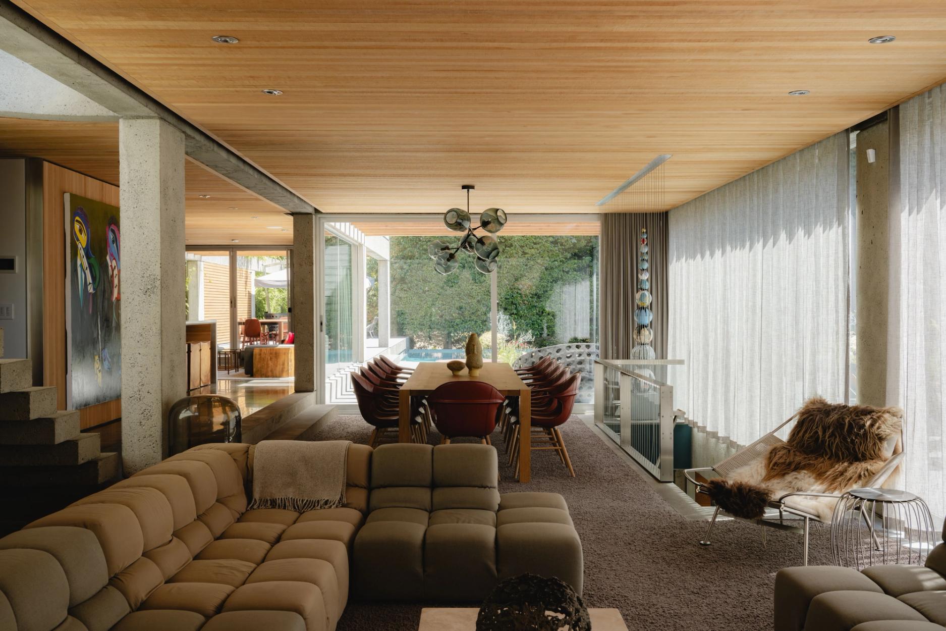
Hassell House living room.
PC
I’ll keeping coming back to this: “Good design doesn’t have to be expensive”. I really wish we could separate this thought that in order for something to be good design, it has to be expensive because it doesn’t. You can make an amazing house out of simple, abundant materials and it’s 1000 times better than some McMansion made of imported Carrera marble.
GF
To move forward, it's essential to shift to a more permanent mindset when it comes to our built environment. Buildings should be constructed with durability and longevity in mind, rather than settling for temporary solutions. Emphasizing quality design and construction will lead to a better and more sustainable living environment for generations to come.
You know, it's funny how our house had some bad tiles from the 80s. It seemed like everyone in the 1980s was obsessed with living in Santa Fe, New Mexico, with those peach-colored terracotta tiles. The tiles in our house were more like 80s pink and didn't quite match our vision. However, the design of the house was incredible—a wall of glass, post and beam structure, and breathtaking views of the garden, park, and creek behind it. Plus, having a fireplace in the middle of the living room, splitting the dining and living areas, was such a unique touch.
When we first saw the house, we knew it was the one. We had to do some renovations and make some improvements, but now, people who come over are amazed. They think it's a new house, and they ask if we added those beams on the ceiling. But, no, that's all part of the original structure, and it's just so satisfying to see how our efforts paid off.
It wasn't an easy decision to move to West Vancouver. We were initially considering neighbourhoods like Gastown and Strathcona, looking at places closer to Main Street or the Pacific District. It took a lot of convincing for me to make the leap to West Vancouver, but I knew the architecture here was exceptional and I had always dreamed of living in a modern house—even before making the Coast Modern film.
When we were renting, we prioritized spaces with good design and quality materials. I remember there were places we rejected because of bad layouts or poor craftsmanship. We wanted a space that inspired us and allowed us to live to the fullest.
Coming out here later to buy this house was truly amazing. We knew it had potential, but we had to undo some things and restore it to its former glory. Now, we have a home that will serve families for the next 50 years, and we're so proud that we didn't tear it down like many others might have done. The fact that we were educated enough and interested in design allowed us to recognize the beauty of this house and restore it to make it shine once again.
Before we start our architectural adventure, Gavin has some final thoughts on modernism and design.
GF
I think many people are not exposed to design culture or art in North America. Museums and art galleries can be a hard sell here. In places like London, museums are often free for kids, ensuring more people are exposed to art, culture, design, and history.
For me, modernism represents the values I appreciate in a home—openness, privacy, and connected living. Architects' designs can truly bring your values to life in a space. Our house was designed by Bob Lewis, who may not be as famous as Arthur Erickson or Barry Downes, but he worked with the same principles of open plan and connected living. His designs were practical and affordable, utilizing pre-fabricated materials.
When you step inside one of these modernist houses, it's just an amazing feeling. I never want to leave, and it's a place where I want to hang out with friends and create beautiful memories. Unfortunately, many generic houses lack that inviting and inspiring feeling. They're just spaces without any soul or thoughtful design.
“Architecture has the power to elevate your experience. That's what I learned from Henrik Bull during my research and interactions with him; he said, ‘Architecture should make you feel good.’”
After our conversation, Gavin and I embarked on a self-guided architectural tour through West Vancouver's Eagle Harbour neighbourhood, a place he also calls home. As we wandered along the narrow streets, we couldn't help but notice the significant changes that have taken place in the area over the past decade. Despite the transformations, there are still pockets of untouched beauty. During our exploration, we shared some of our favourite hidden gems with each other. Eventually, our journey led us to the home of renowned Vancouver architect Barry McCleod. Designed by Barry himself in 1966, the house exudes the beauty of simplicity and thoughtful design. To our surprise, Barry welcomed us with utmost graciousness and invited us inside for a personal tour of his home and office. I could easily devote an entire article to describing the beauty and thoughtfulness of Barry's architectural masterpiece. Design can take you on so many unexpected journeys.
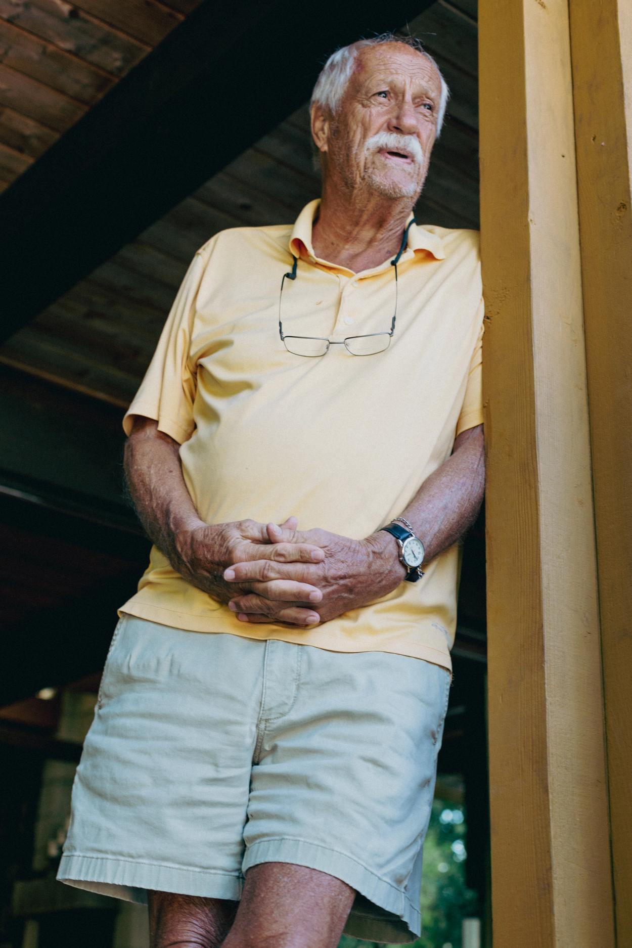
The legend Barry McLeod.
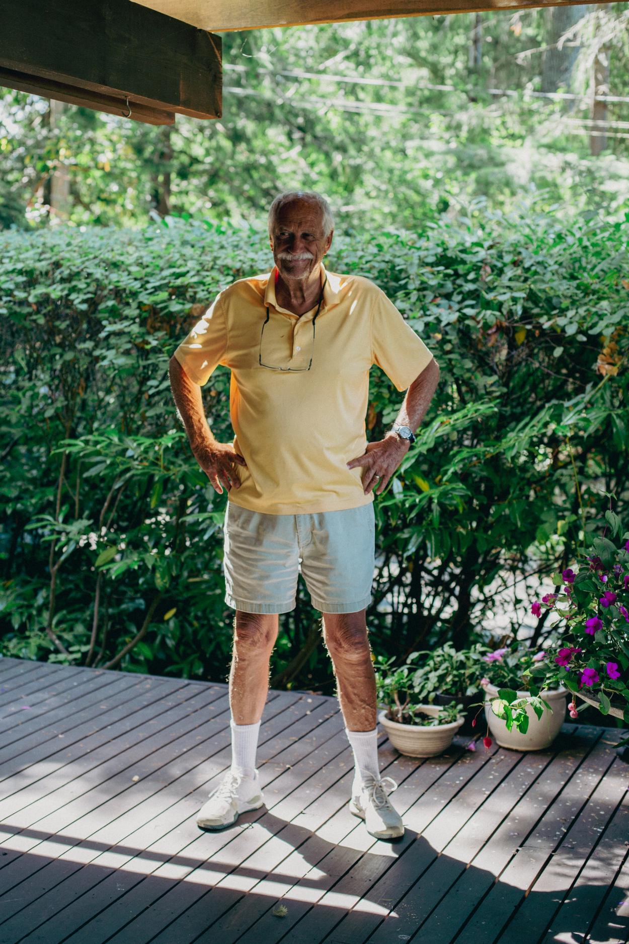
Barry striking his best pose.
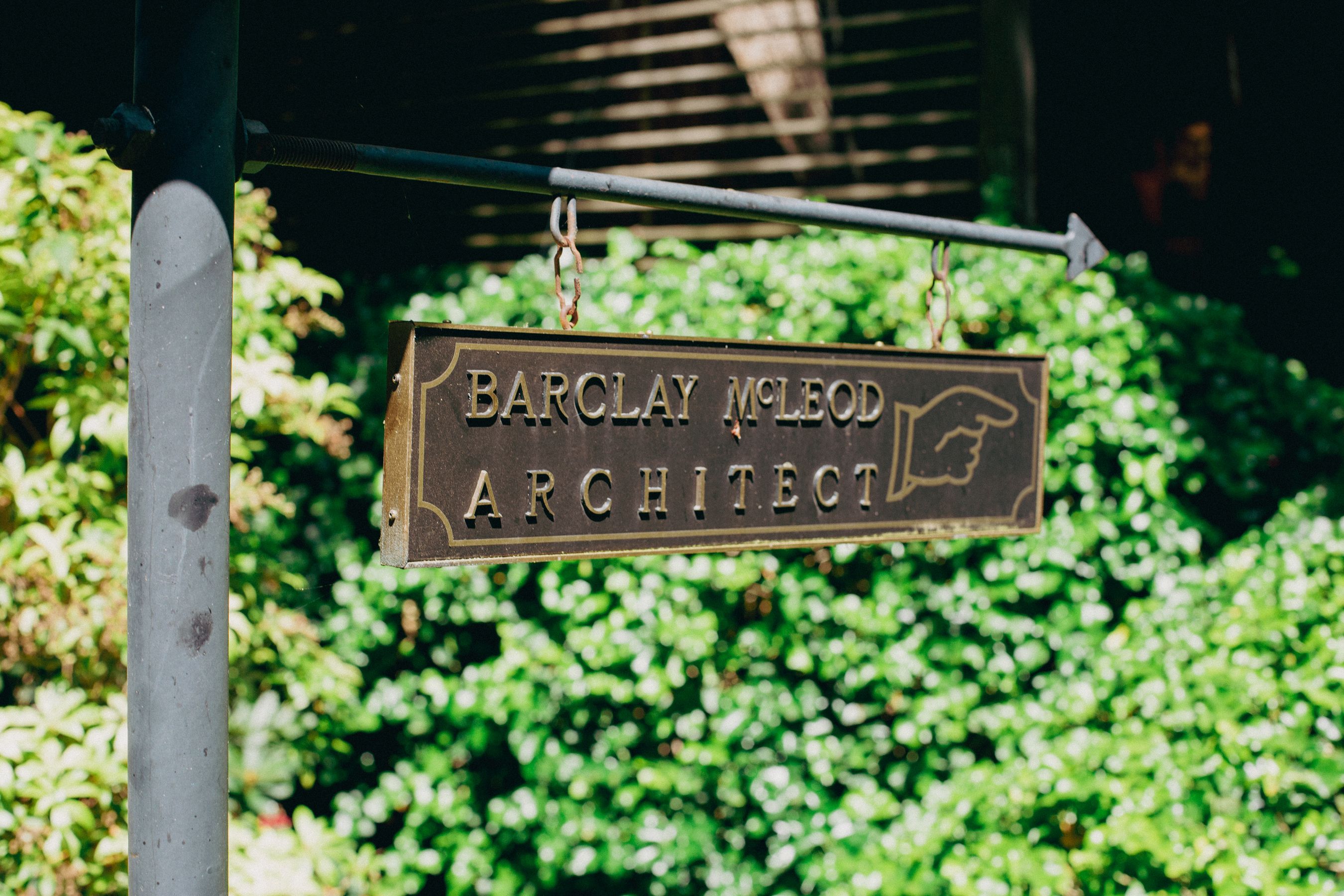
Sign to Barry's home office.
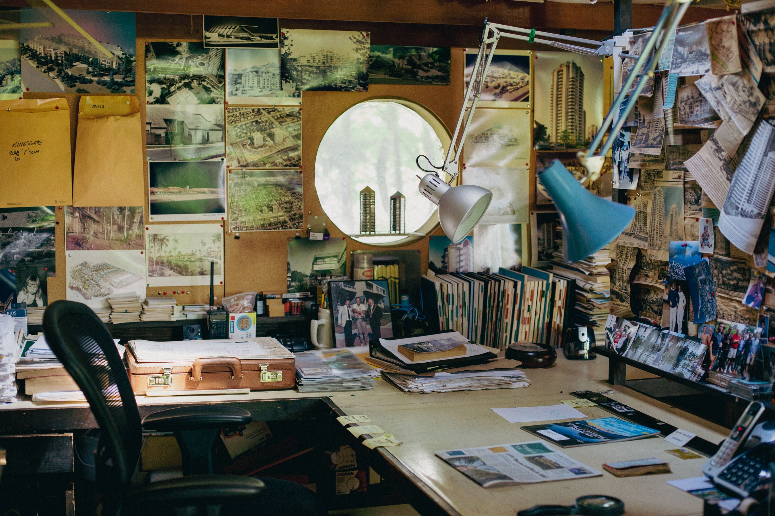
Barry's home office and archive.
Words and Photography: Patrick Campbell
