Designer Kate Richard reimagines a loft that doesn’t take itself too seriously
Struggling to find the balance between form and function in his loft, art director Jake Ahnert enlisted designer Kate Richard (Ette) to help the space find its flow. Using a minimalist palette of cherry wood and aluminum, Richard's reimagining of the space is refined and doesn't take itself too seriously. I virtually sat down with Jake and Kate via Instagram to discuss the project and get some insight on how this renovation came together.
Patrick Campbell
Tell me a little bit about how the loft project came to be. What was it about Kate’s design practice that inspired you to work with her?
Jake Ahnert
Ever since I moved into the apartment, I loved the bones of it but soon came to realize that it lacked storage and functionality. I had bought some furniture and placed it around, but given that the space is a rectangular studio, I felt like it ended up creating a sort of maze of flow through the apartment. Having spent a lot more time there during covid, I came to the realization that incorporating built ins and moving the furniture to the outside edges of the apartment would open up the space and get rid of that maze like feeling. I wanted to work with Kate, because I wanted it to be someone designing it that is someone from a similar circle and demographic. I thought that the idea of incorporating the design work and pieces from locals/friends would give it a lot more sentimental value, plus Kate has always had one of the most inspiring apartments to me.
PC
Besides budget, were there any other parameters you set for Kate when designing your loft?
JA
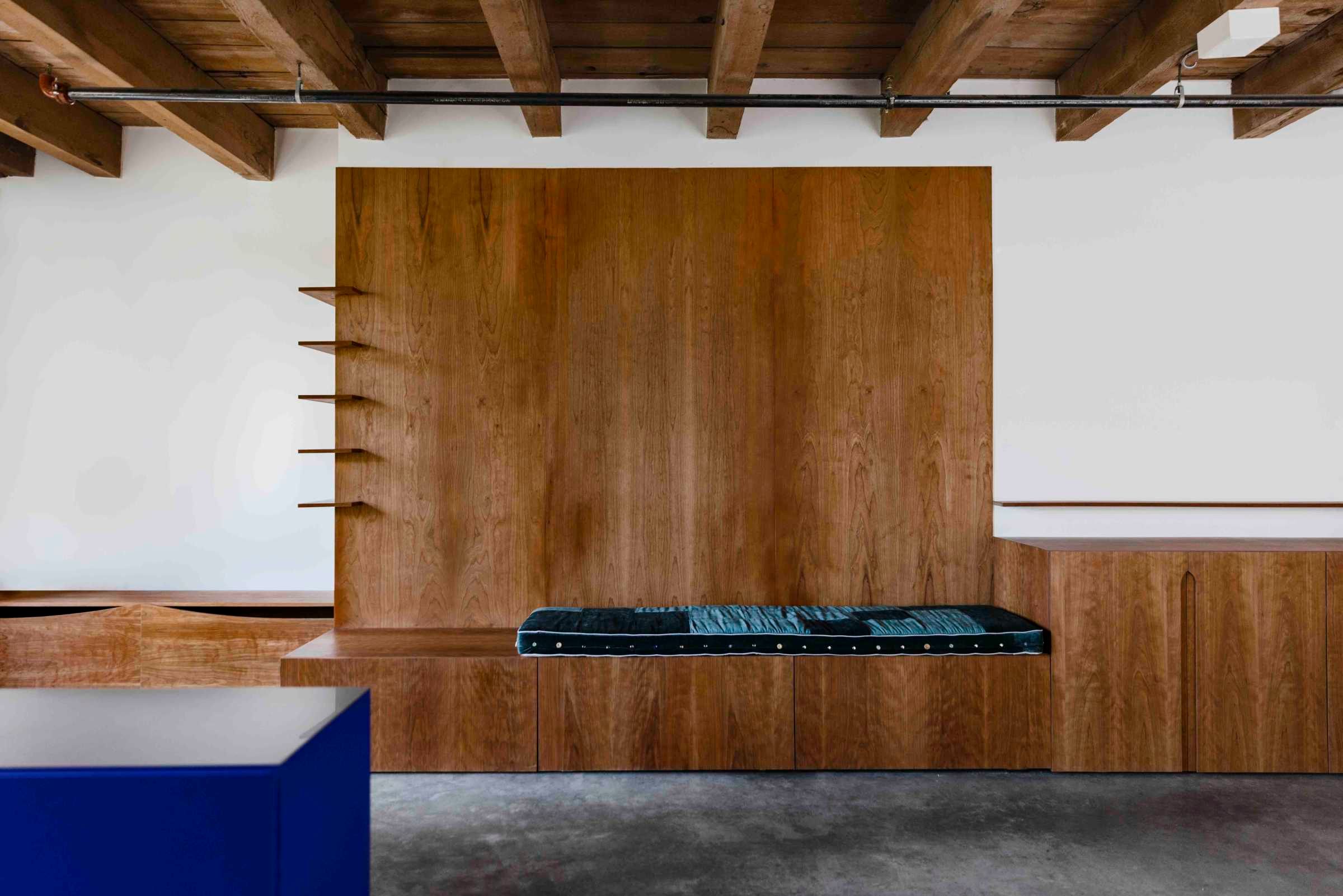
The only real parameters were that there would be a lot more storage than we started with, and that the main building material would be wood. Given that the space already incorporates cement floors and original wood beams I wanted something that would sit within the space and seem complimentary to the existing features.
Patrick Campbell
Kate, when we first met, you had been focusing on smaller objects like the butterfly stool and the tube vase. How has it been transitioning into these larger renovation projects compared to the objects?
Kate Richard
I studied industrial design so during that time my focus was on furniture and objects. Engaging with the form and materiality of objects is definitely fun but that has always been driven by a larger, philosophical interest I have with everyday life and how we interact with the world around us. Whether it's the material of a door handle, the shape of a chair, the height of a wall or the size of a room, everything is connected and interacts to create a larger whole. Designing larger projects felt like a pretty natural progression creatively speaking.
PC
Coming from that solitary design practice, how was it taking on Jacab as your first interior design client? Was it collaborative in any way? And if so, how did the process go?
KR
After graduating from my bachelors I ended up working in interior design and architecture. I completed a lot of projects for other firms during those years so it was exciting to be able to take on a project of my own. Jacab and I definitely worked together to ensure the design met his needs but Jacab put a lot of trust in me for the project which gave me the creative freedom that I think every designer hopes for.
I think a refined material palette can allow materials and their form to speak for themselves.
PC
What characteristics of the home are important to you Jacab?
JA
I think the question can be answered in different ways, but in a smaller studio space like this, I think multi-functionality of spaces is really important. Having a space like the dining nook Kate created that can serve as a place to eat, read or work really makes the space feel a lot more organic and I think also is a lot more comfortable than having multiple standalone stations for activities.
PC
Kate, you kept the material choices minimal for this project, using only cherry and aluminum. Tell me about that decision to use sparing materials for this project.
KR
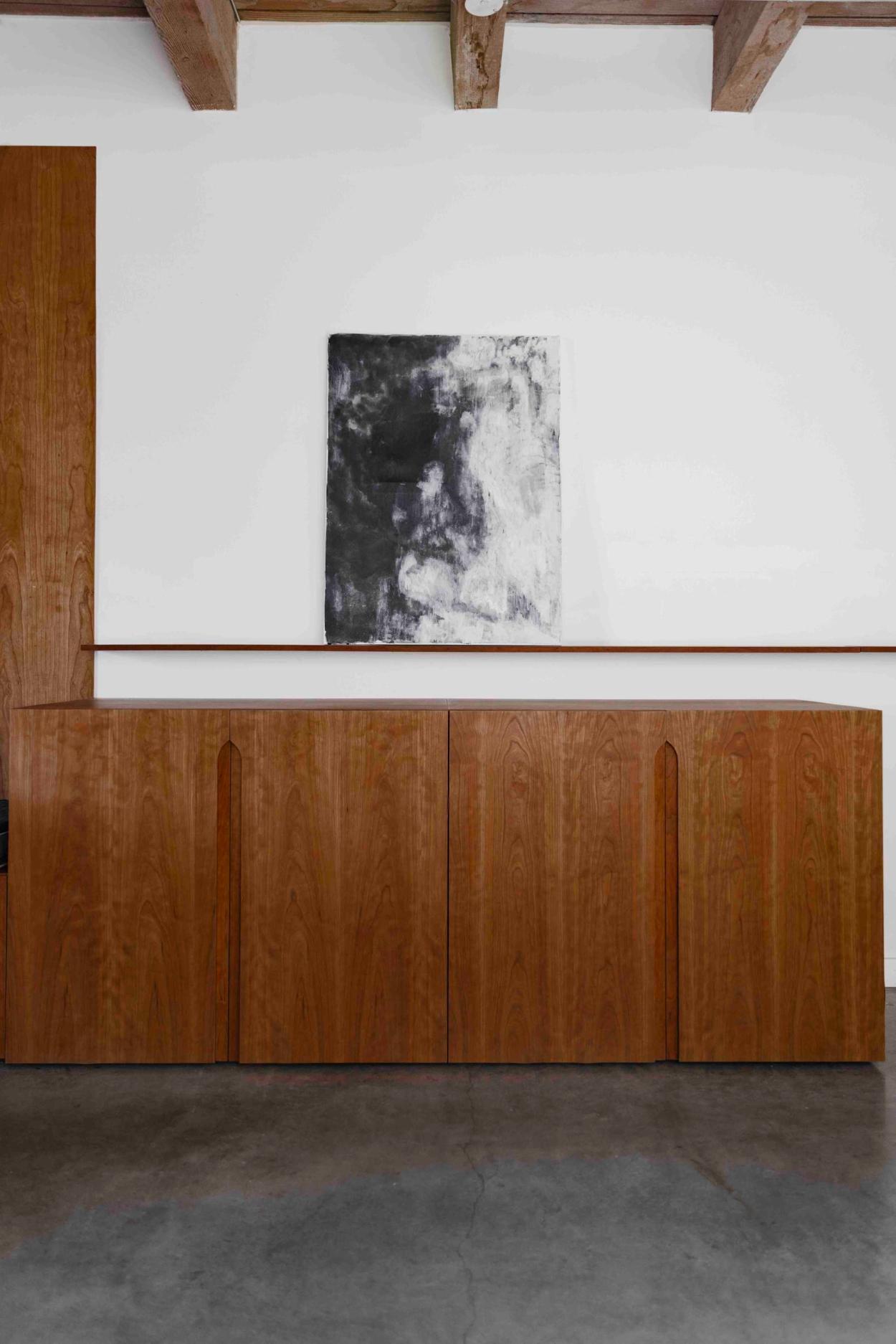
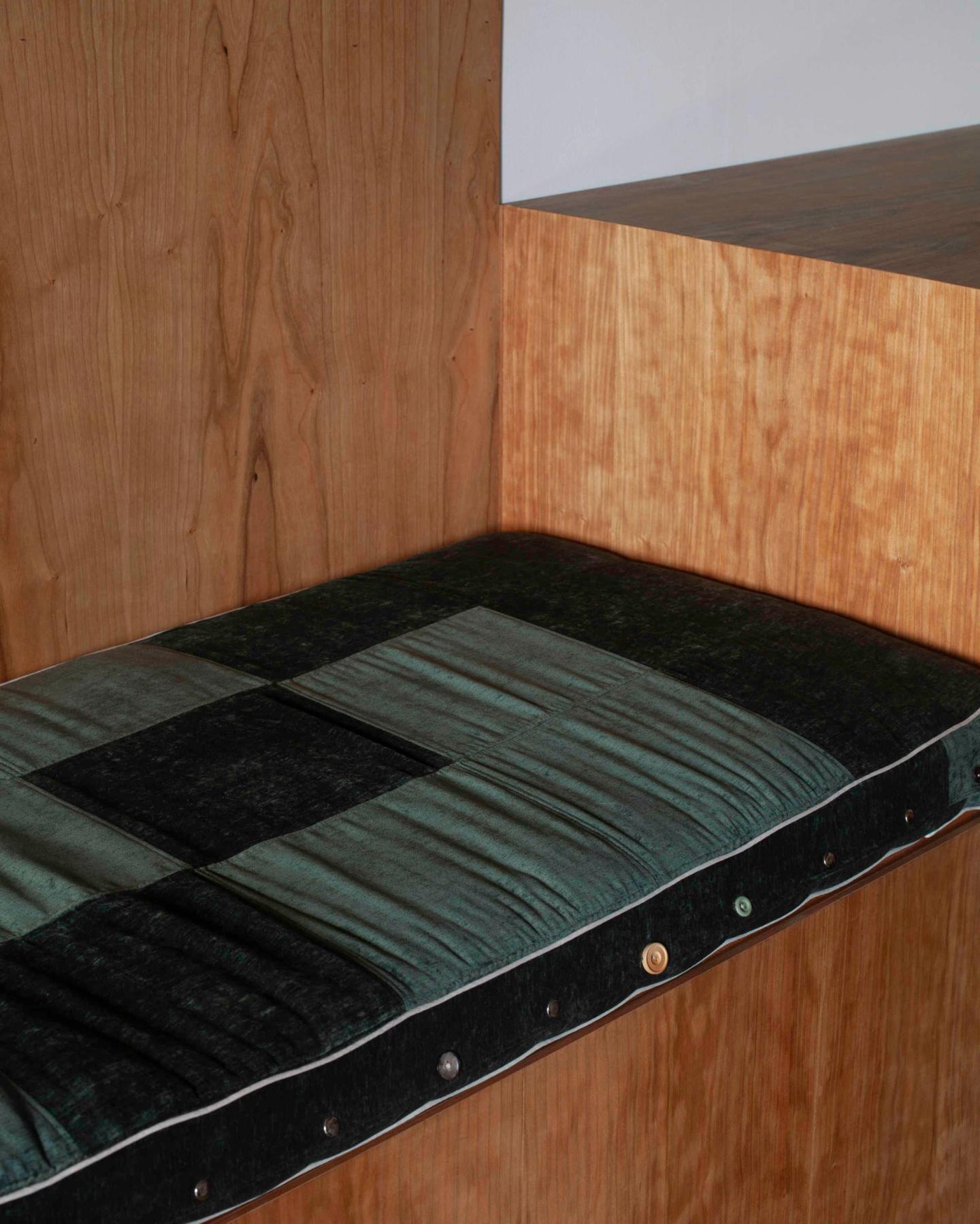
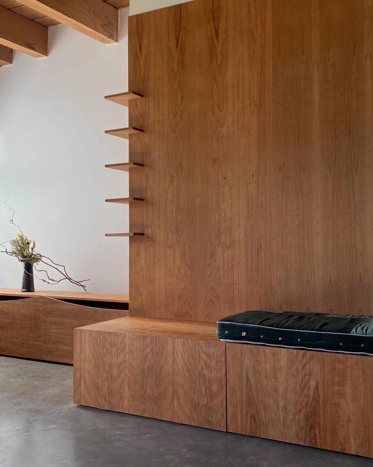
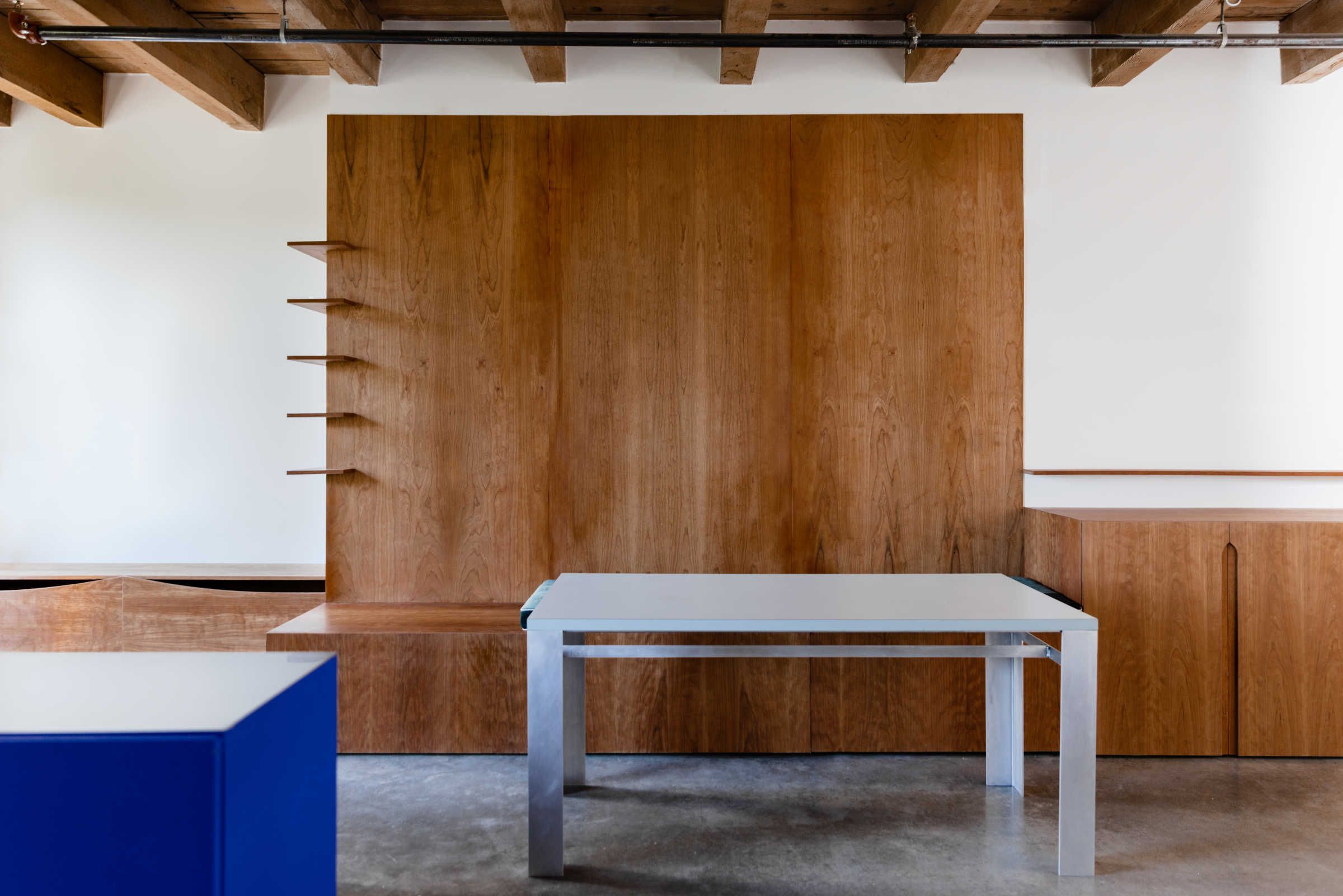
I think a refined material palette can allow materials and their form to speak for themselves. The existing space had a beautifully aged Douglas fir beam ceiling, we wanted a material that would sort of celebrate that. This ended up being a cherry plywood that will darken over time.
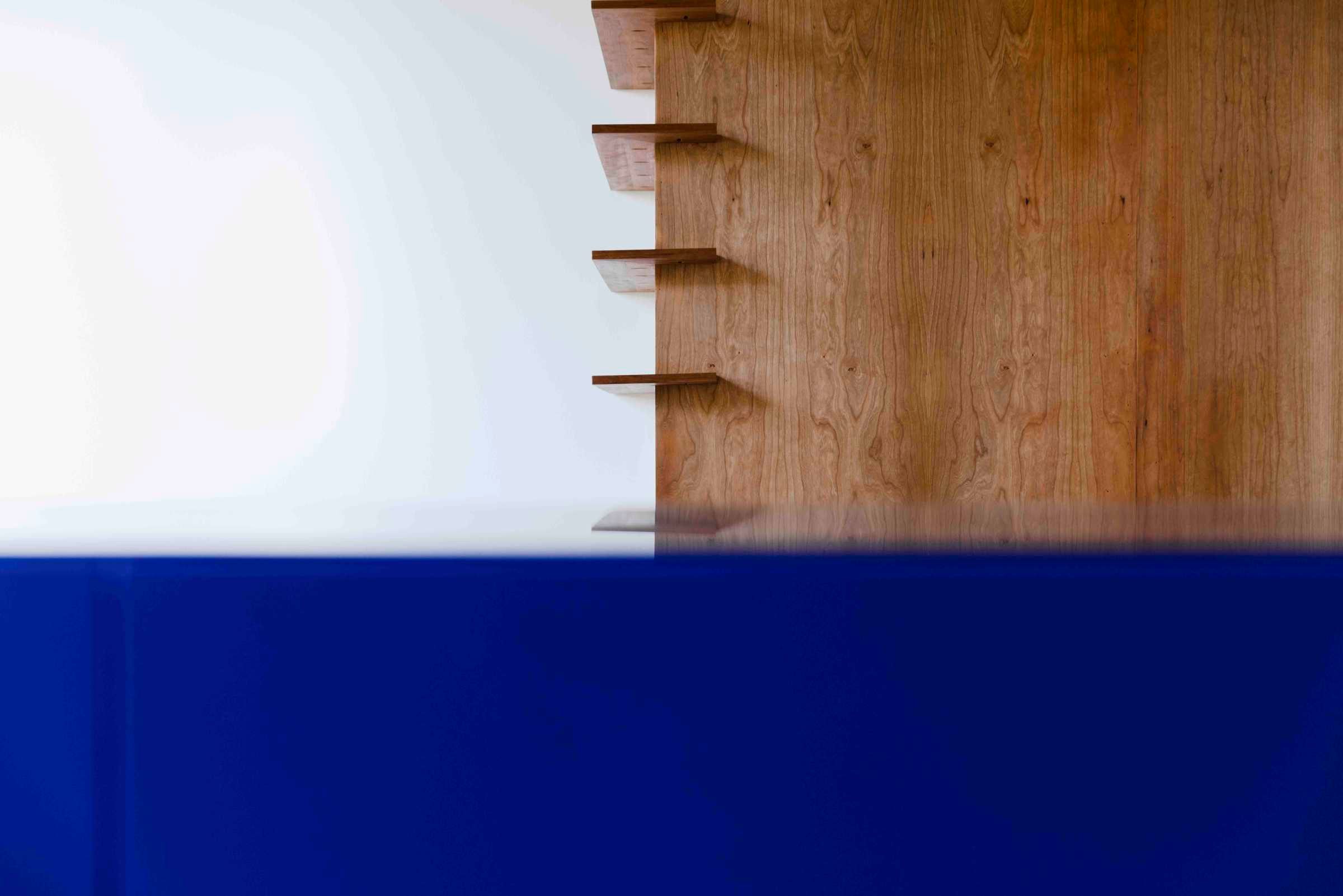
It also made a piece that could’ve been very nondescript, a kitchen storage unit, into a statement piece.
PC
I love the incorporation of Klein Blue into the project. Whose idea was that?
JA
It was Kate's idea; I think given that everything was so neutral we thought it would be fun to add a pop of colour. I think it also made a piece that could’ve been very nondescript, a kitchen storage unit, into a statement piece.
KR
I think people are often afraid of colour. The intensity of the blue adds a bit of fun and allows the space take itself less seriously.
PC
Kate, tell me about the decision to get Daniel McDougal to do the custom upholstery for the benches. They add this wonderful handmade and warm texture to the project.
KR
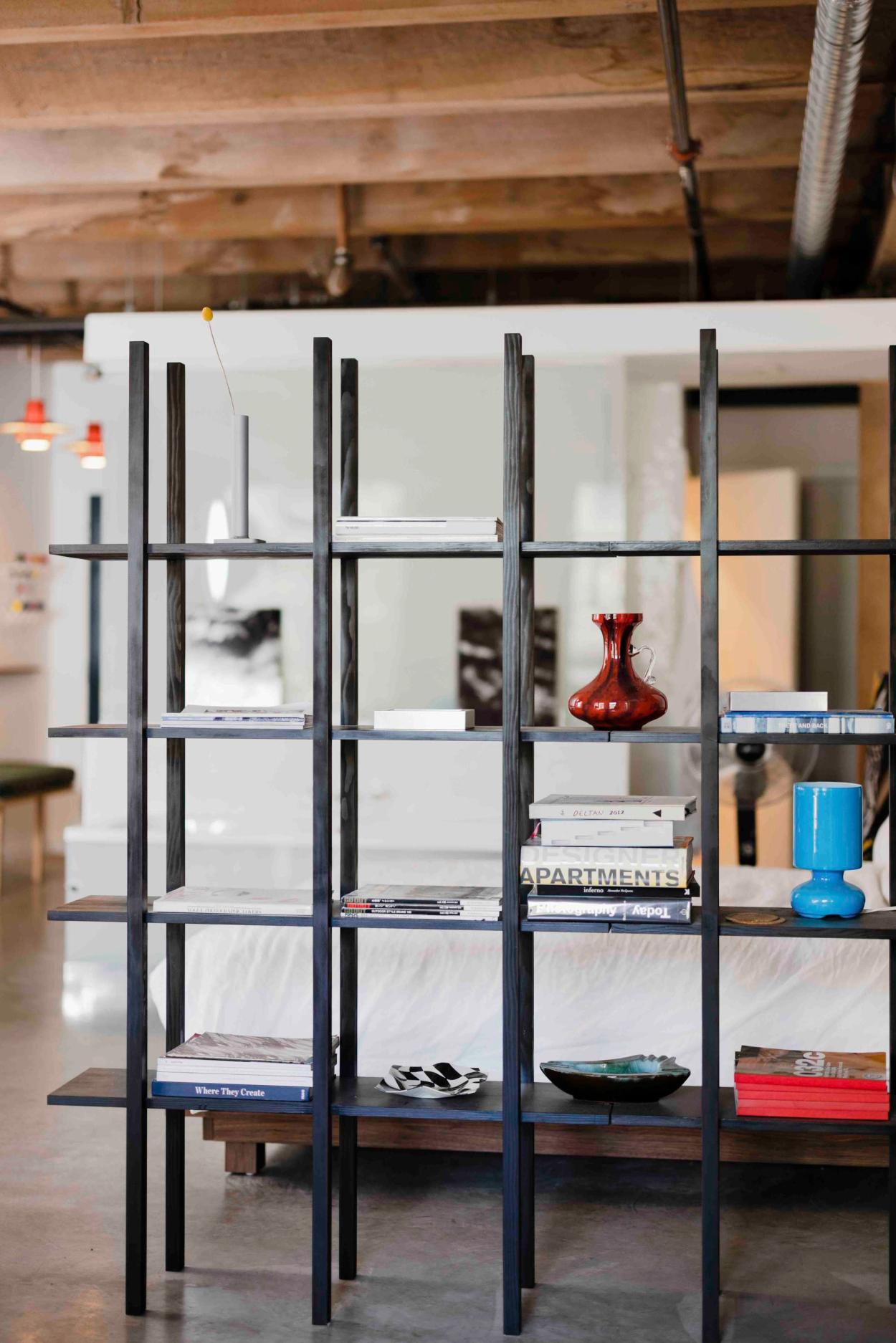
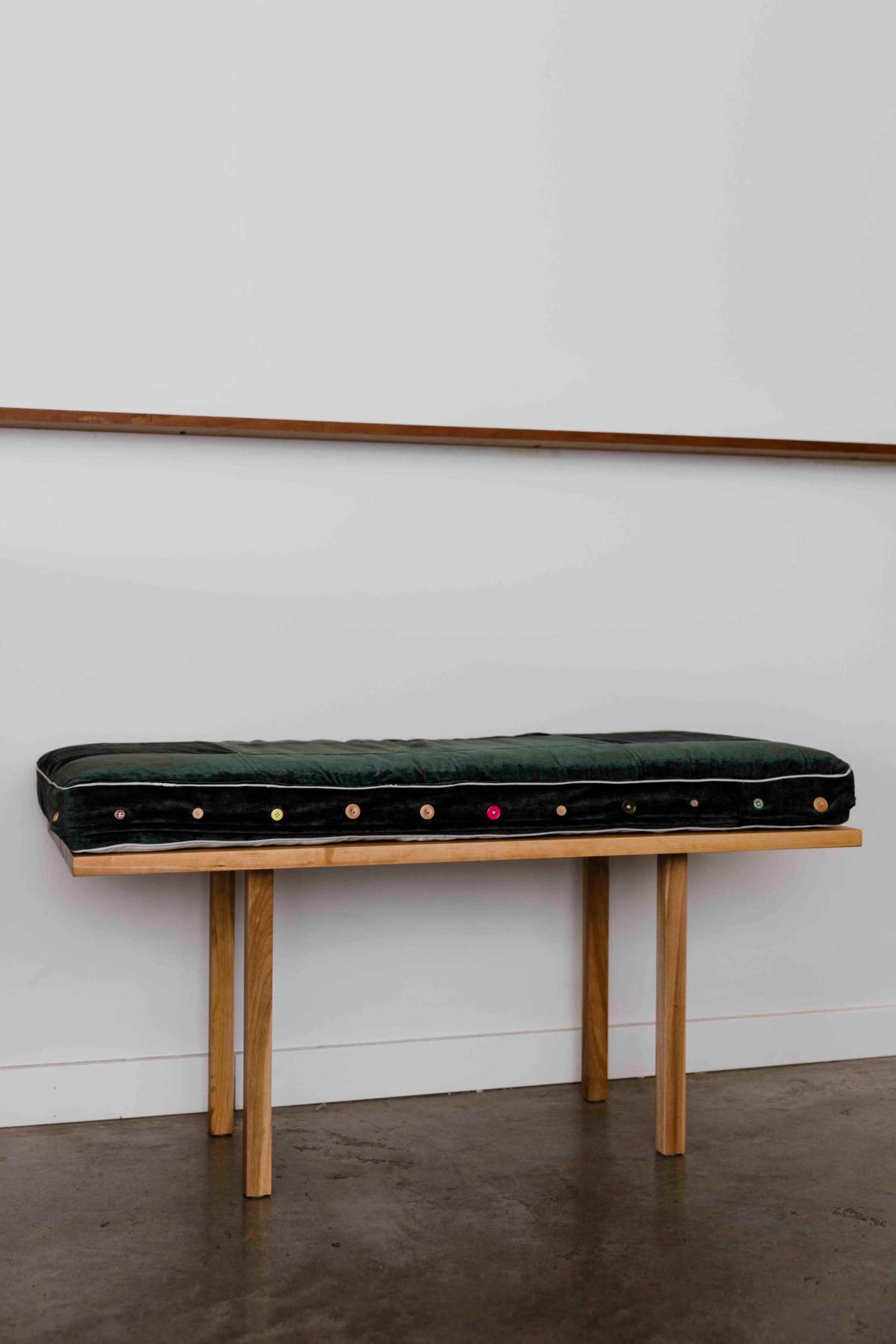
Daniel is a close friend of mine and I’ve always loved his work with textiles. He did some custom upholstery for me in the past and has a great attention to detail. The pieces for Jacab were hand stitched into a subtle checkered pattern and fastened with various buttons Daniel had collected over time. The imperfect quality of anything made by hand has a particular beauty that cannot be produced by machine. I think Jacab and I both prefer working with friends and local craftsman when we can, it allows the furniture to be much more personal. I ended up designing a lot of custom furniture for this project. The solid cherry bench and aluminum/laminate dining table were fabricated by Manner Studio who also did the millwork for this project. The douglas fir shelving stained with india ink were fabricated by Joseph Friedrich and I at his wood shop just down the street from Jacabs loft.
PC
Jacab, How would you describe the functionality and usability of the space now compared to before the renovation?
JA
Since the renovation, I have really enjoyed the space a lot more, it feels way less claustrophobic to me to have the centre of the space be open and mobile. Having the ability to tuck away any items I wasn’t using on a daily basis to the cabinetry and drawers, made everything feel much more clutter free. The dining nook in particular is a space that I found myself hanging out at a lot more, and not just for dining, but just relaxing also. I love the way that the cushions make the zone feel so casual and comfortable during the day, but can then be transformed by pulling the bench around to host a dinner party in the evening.
PC
Were there any valuable lessons or insights you both gained from working on this project, and how do you see these lessons influencing future design projects you both may take on?
JA
I think the main lesson I learned from this was allowing myself more time to be there in person for the installation process to oversee all the details as they are happening in real time.
KR
Having custom furniture made definitely adds a layer of complication to a project that you wouldn’t necessarily face buying from a store. It takes more time, there is more risk and requires a lot of communication and collaboration between the designer and fabricator. I think this project allowed me to realize value of small details, like custom furnishings etc (that may seem unnecessary to some) outweighs the added complication and it’s something I am still doing on current projects.
Words: Patrick Campbell
Photography: Cody Briggs, Malcom Lam

