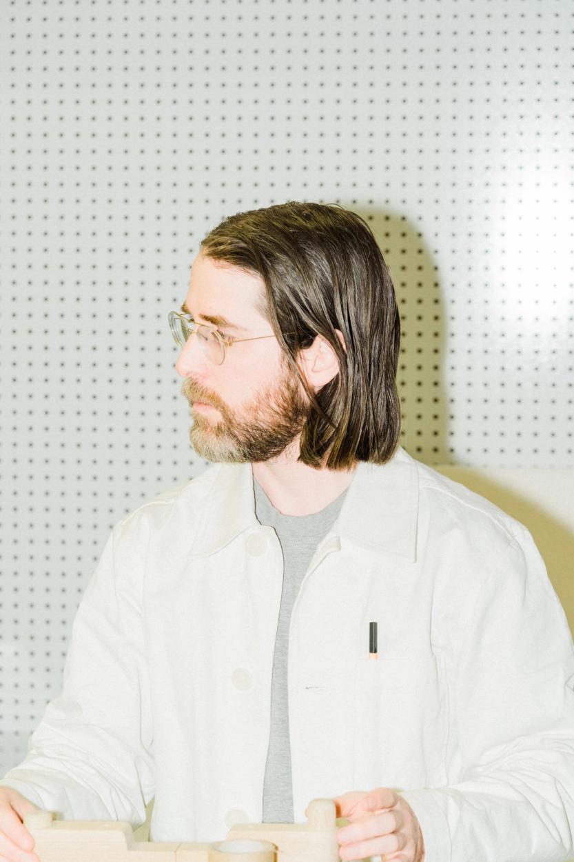
Straddling the worlds of wine and design with Claire Saksun
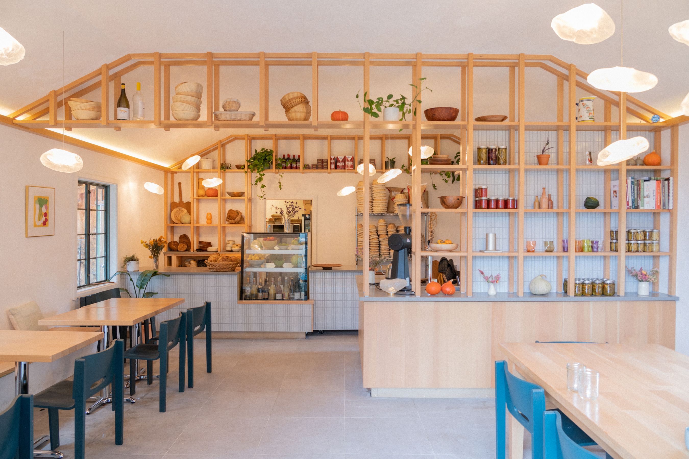
Francis Bread
Photo by Guy Ferguson
A designer based in Vancouver, Claire recently completed Francis Bread on Salt Spring Island. After obtaining her Masters of Architecture at the University of British Columbia, she’s worked for Scott Posno Design as well as Ste.Marie. We sit down with Claire to discuss her recently finished project and her decidedly un-minimalist approach to her own home design.
Patrick Campbell
We originally met through the wine world years ago when you were at Burdock and Co. I never knew you had studied to be an architect until way later on. What brought you back to architecture? And where did your fascination with architecture begin?
Claire Saksun
I have always gone back-and-forth between these things: wine, restaurants, and design. I originally left the restaurant industry in Toronto for architecture school here in Vancouver. Then, when I was in architecture school, I made an effort to integrate my interest in agriculture and food systems into basically every studio project that I could. My final thesis was a subversive future farm-to-table strategy presented as a cookbook, as I was really into the idea that the cookbook is a pivotal feminist text through history. I had asked Craig Stanghetta, the founder of Ste Marie Art and Design, who at the time designed all of the most exciting restaurants in Vancouver, to be on my panel. I wanted him there to balance out the more academic approach to a thesis about a hypothetical restaurant. After I graduated, it felt like more of a continuation of what I was thinking about and interested in to work in restaurants again instead of going and working at an architecture firm. Eventually, after a couple of years as a sommelier in the city (in and around the time that we met, Patrick), I was pulled back into the office by Craig Stanghetta. He hired me for a hybrid role, bridging the knowledge gap between the restaurant clients they worked with at Ste Marie and the in-house designers. That was really my entry back into design, and from there I have since moved into more “capital A architecture."
I think my fascination with design started with an interest in people—how different people live and how spaces can be ultimately useful while still holding the idea of personal expression at the forefront. I think I resisted architecture as a profession for so long because not all types of work allow room for that personal deep dive or necessitate a fine-grained understanding of the specific user as a unique personality. Most building types are used by lots of different kinds of people, and that presents its own unique design challenge. Landing now in architecture firms that focus on houses and doing houses in my own practice, I think I am able to tap into that original fascination and personal connection.
PC
When you finished your architecture degree and went to work as a sommelier, did you find yourself redesigning the restaurants you worked at in your head? I could only imagine you would start to see flaws everywhere or how you would have done things differently regarding the space's flow or efficiency. I will often see a beautifully designed restaurant, but I can tell that the architect hasn’t worked in the service industry. The food pass is too narrow, the hostess stand is cramped, etc. What was it like coming back into the hospitality industry with a new understanding of spatial design?
CS
For sure. Being involved in both fields has definitely informed my philosophy that designers should leave their egos at the door and really listen to users first. The staff who grind it out on the floor every night are the best resources for the realization of a successful restaurant. They know what will work and what will not better than anyone else. The restaurant I worked at just after architecture school had a corporate backer, so they actually had a pretty top-down “designed” space, which I have come to think is usually the least successful as a restaurant, as you say. The more input from the restaurant staff, the better, which is something that usually happens when a restaurant has less money and they end up doing a lot of it themselves. But yes, I definitely had thoughts, especially when it comes to acoustics, which is often a wildly overlooked part of restaurant design.
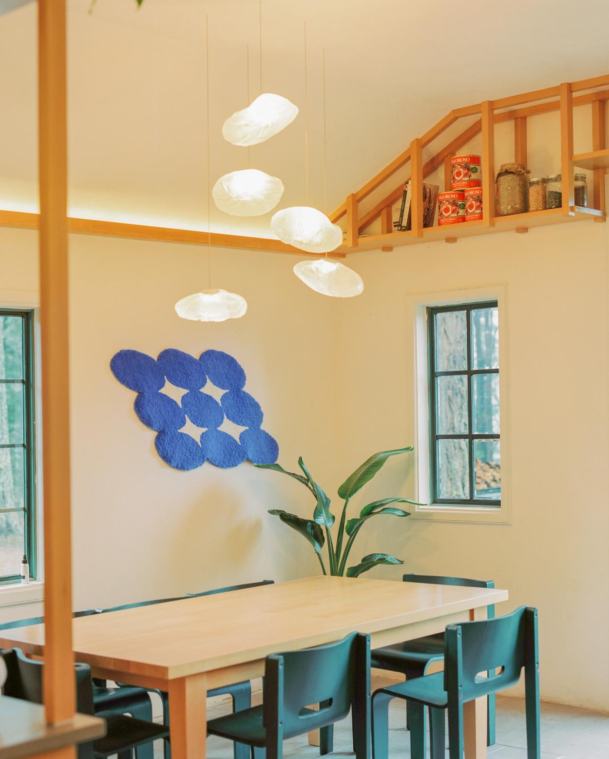
Francis Bread
Photo by Guy Ferguson
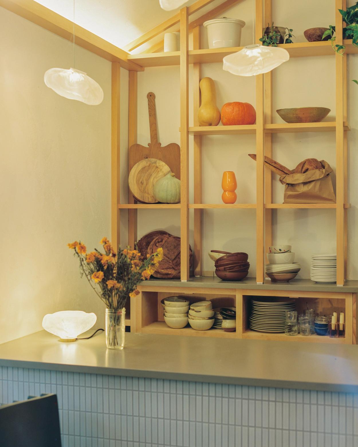
Francis Bread
Photo by Guy Ferguson
That building already had so much soul, and we were very deliberate about not stripping that away while still providing some needed updates.
PC
Agreed, acoustics are such an integral part of the dining experience but are often overlooked. It’s so unfortunate when you’re sitting down to a nice meal and you can’t even hear your fellow dinner guest a few feet away. You recently designed the new Francis Bread on Saltspring Island. Tell us how that project came about.
CS
Meghan and Peter, who are the owners, have been friends of mine for a long time. I actually knew Meghan before either of us worked in restaurants. Designing both locations was such a pleasure, and quite honestly, they are my dream clients. When we designed the first Francis location, we were inhabiting a small cabin that was once Peter's mom’s art gallery. That building already had so much soul, and we were very deliberate about not stripping that away while still providing some needed updates. It was important that the bakery be true to the place without being a stereotype of a Salt Spring Café. We stuck with a tight material palette of fir, concrete, plaster, and glass. We kept everything quite natural and paired back to make room for the objects in the room and the bread to shine. It was a really holistic project for me, as I quilted a bunch of the pillows for the space too. I also worked the opening party, serving wine. It was pretty cool.
When we did the second Francis, it was kind of the opposite scenario where the building was brand new, so we were tasked with injecting the Francis soul that we cultivated in the first project into an empty shell. We used the same material palette for continuity and actually brought all the lights over from the old location. I’m really pleased with the result, mostly because we ended up with something that was so representative of them and their vision. It means a lot to me to give shape to places that already hold so much importance in the community. And it’s actually funny because they now live in the old bakery location, so the design lives on.
PC
You recently purchased a home with your partner, Ryley, who also studied to be an architect. How has that been collaborating with your partner, say, vs. a client in the space?
CS
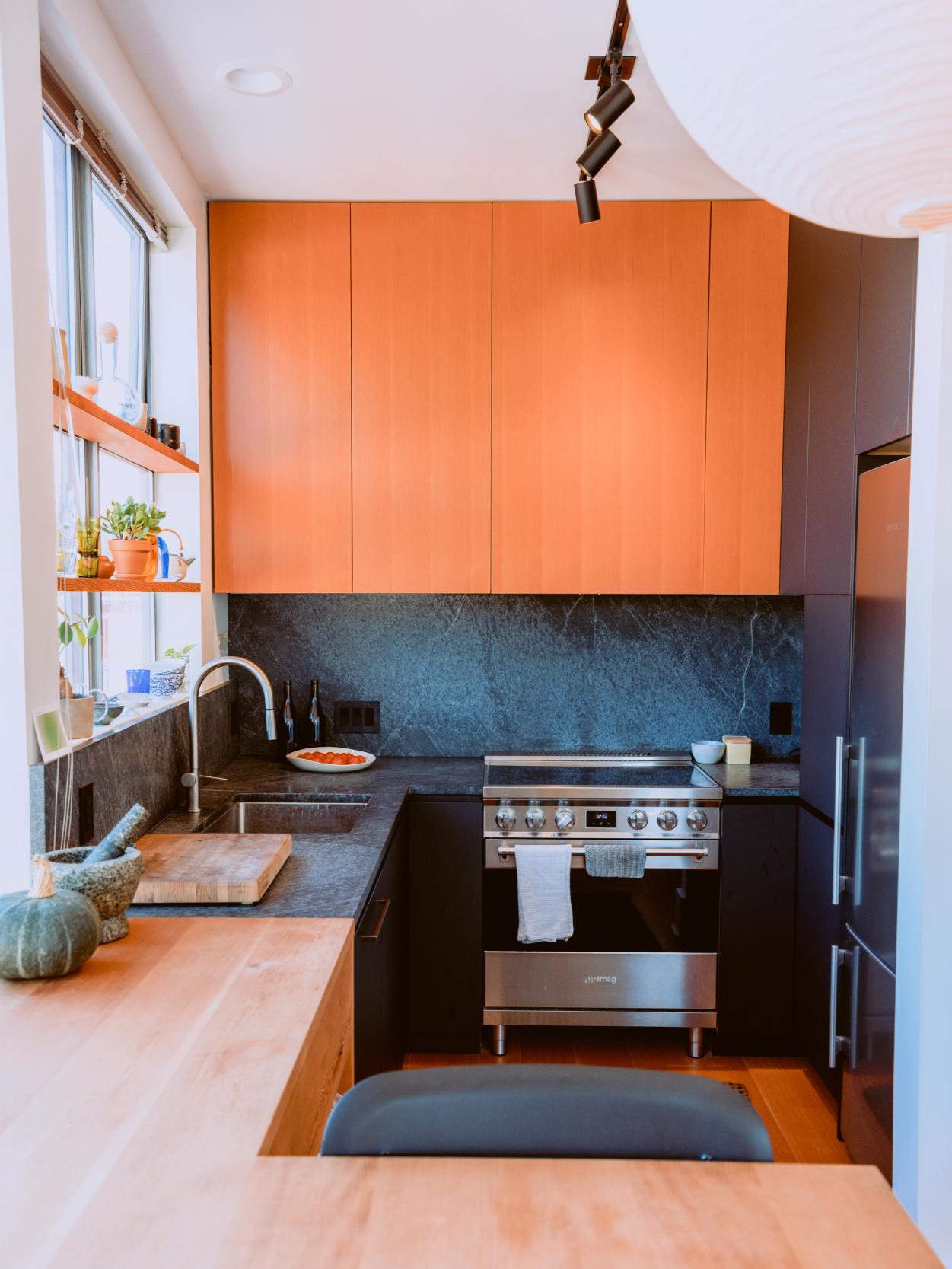
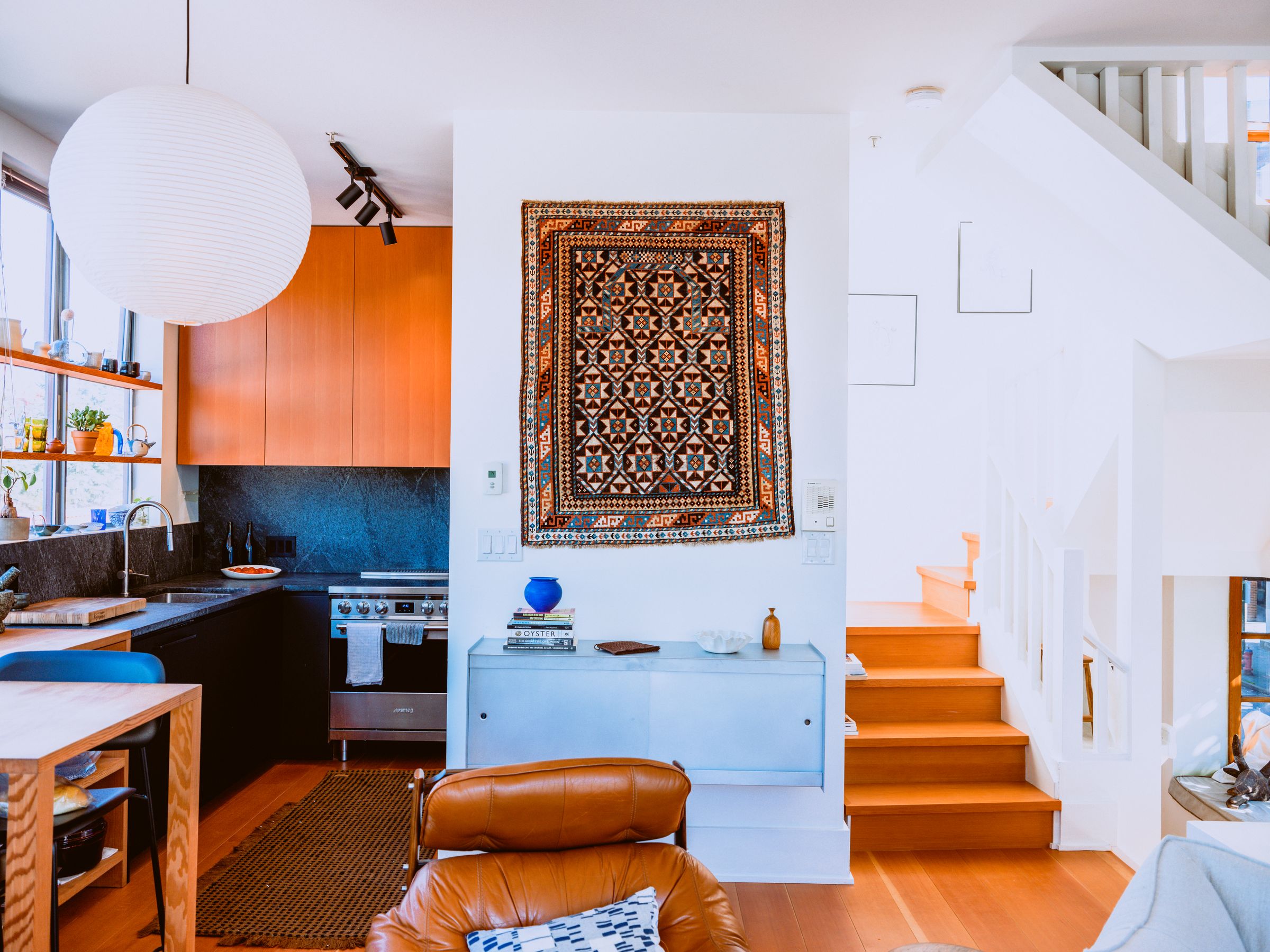
Honestly, I really like design constraints, and the biggest constraint of all is usually a client's opinions and preferences. For that reason, I initially found it very nebulous to work on our home. Lucky for me, Ryley has lots of opinions, and we have pretty specific kitchen needs as a couple of serious home cooks. Ryley brings an attention to detail and construction that has been integral. He is actually working as a millworker now, so we have different but relevant skills in the design space. It’s been so fun and rewarding to get to use something you designed for yourself. We have this little coffee station that brings me so much joy to use because it was such a pain to figure out. And there’s this thing where you don’t need to wholly justify every decision; you can do things because you like them. That’s new for me. I actually think I should apply that sentiment to other projects more often.
PC
You mentioned that you like working within tight design constraints, and I know that your home would be considered a challenging site to redesign. What are some issues that you’ve run into while designing your home?
CS
Yes, it’s a wacky site. Our townhouse block was designed in the 1990s by a group of architecture professors from UBC who took it on as a challenge. Each unit is totally different, and there are lots of diagonals to contend with in the plan. When I actually got into the drawings, I started to understand the intent behind a lot of these nooks and crannies, and I actually uncovered that it’s a pretty well-laid-out set of floor plans. We didn’t change much fundamentally, and the task became more about furniture layout, smart built-ins, and making use of the space that we had. It was cool for me to uncover that the weird floor plan we inherited was actually really well considered. And like I said, I really like design constraints.
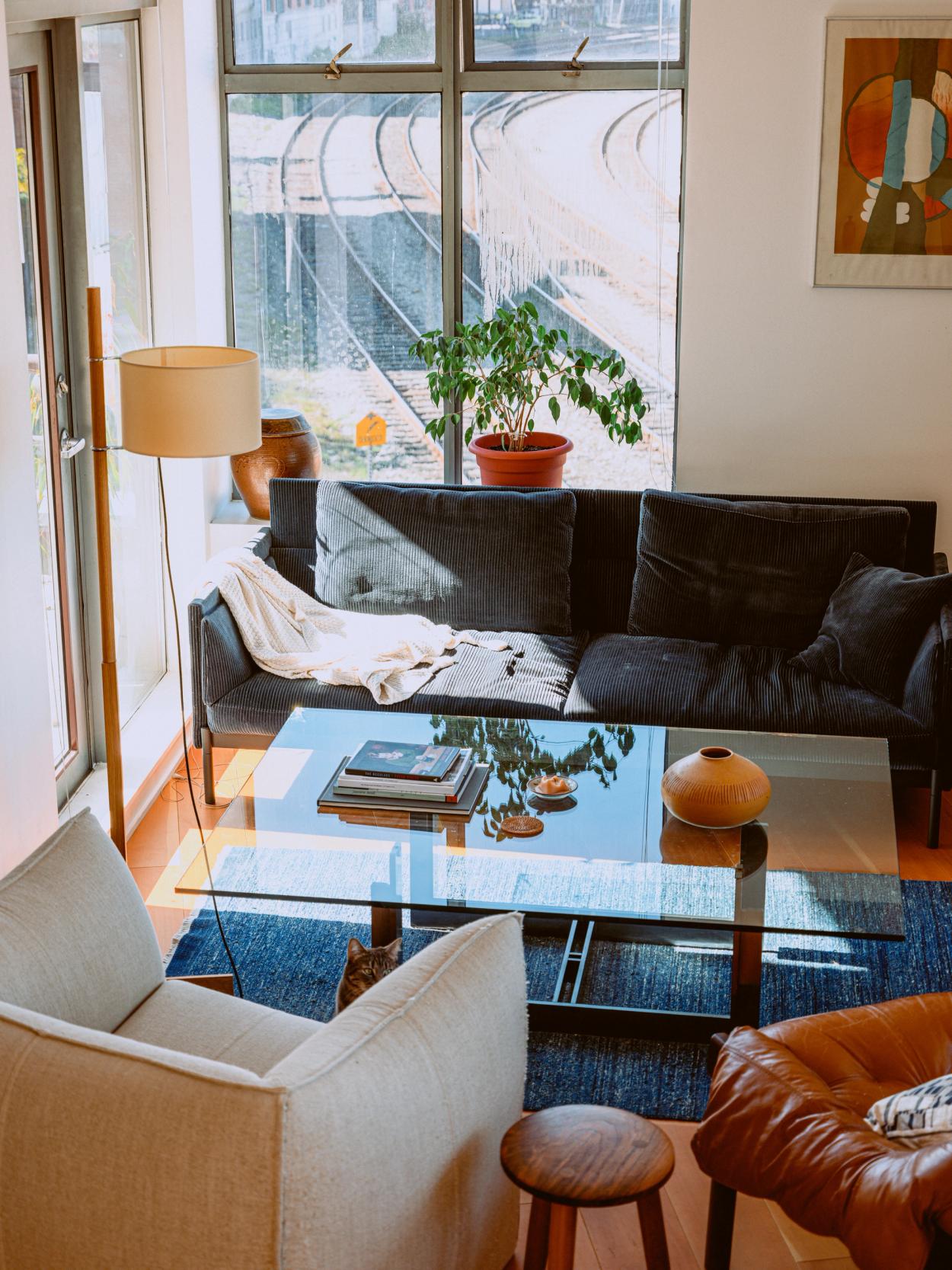
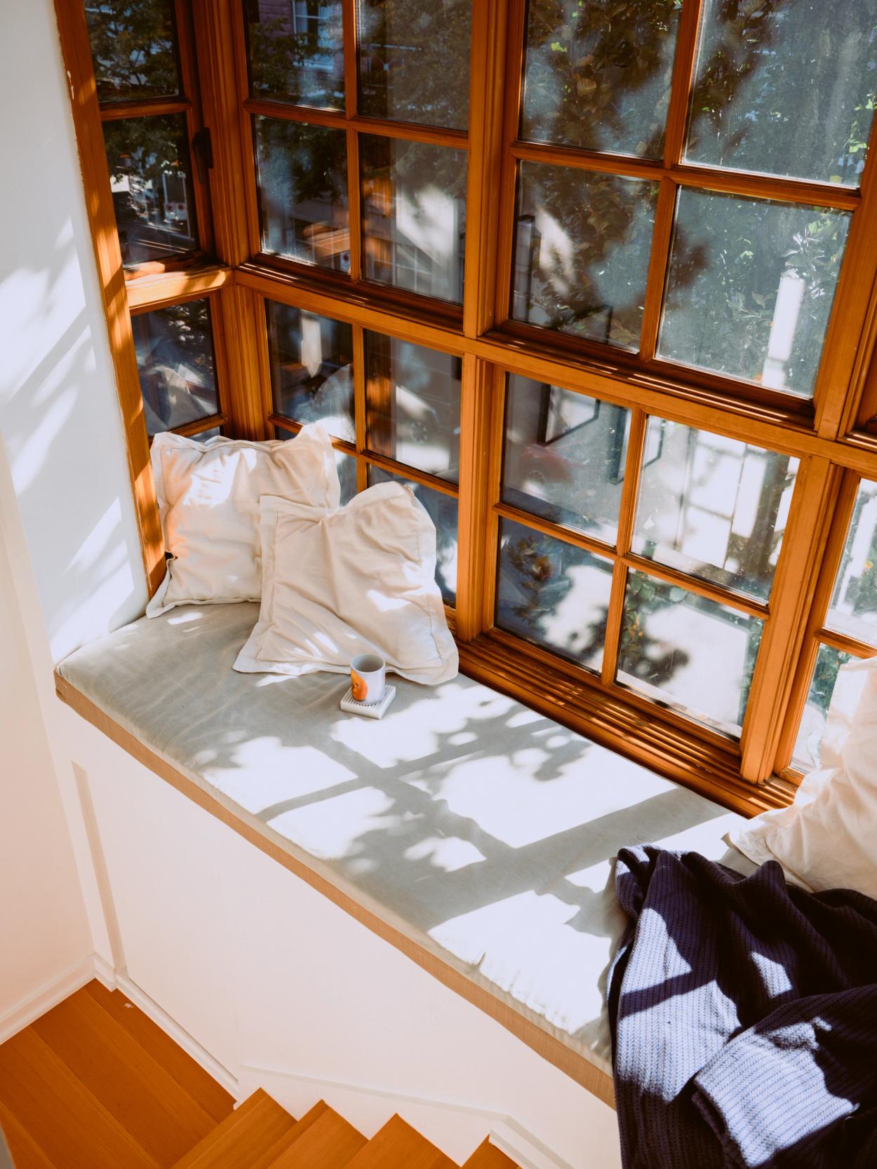
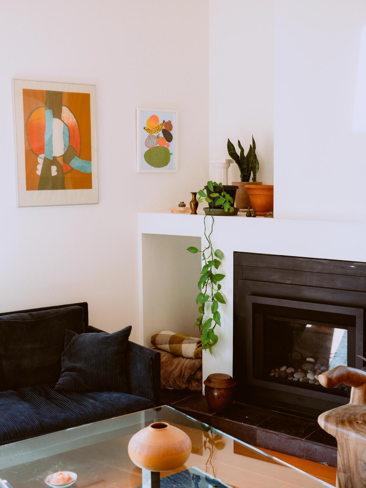
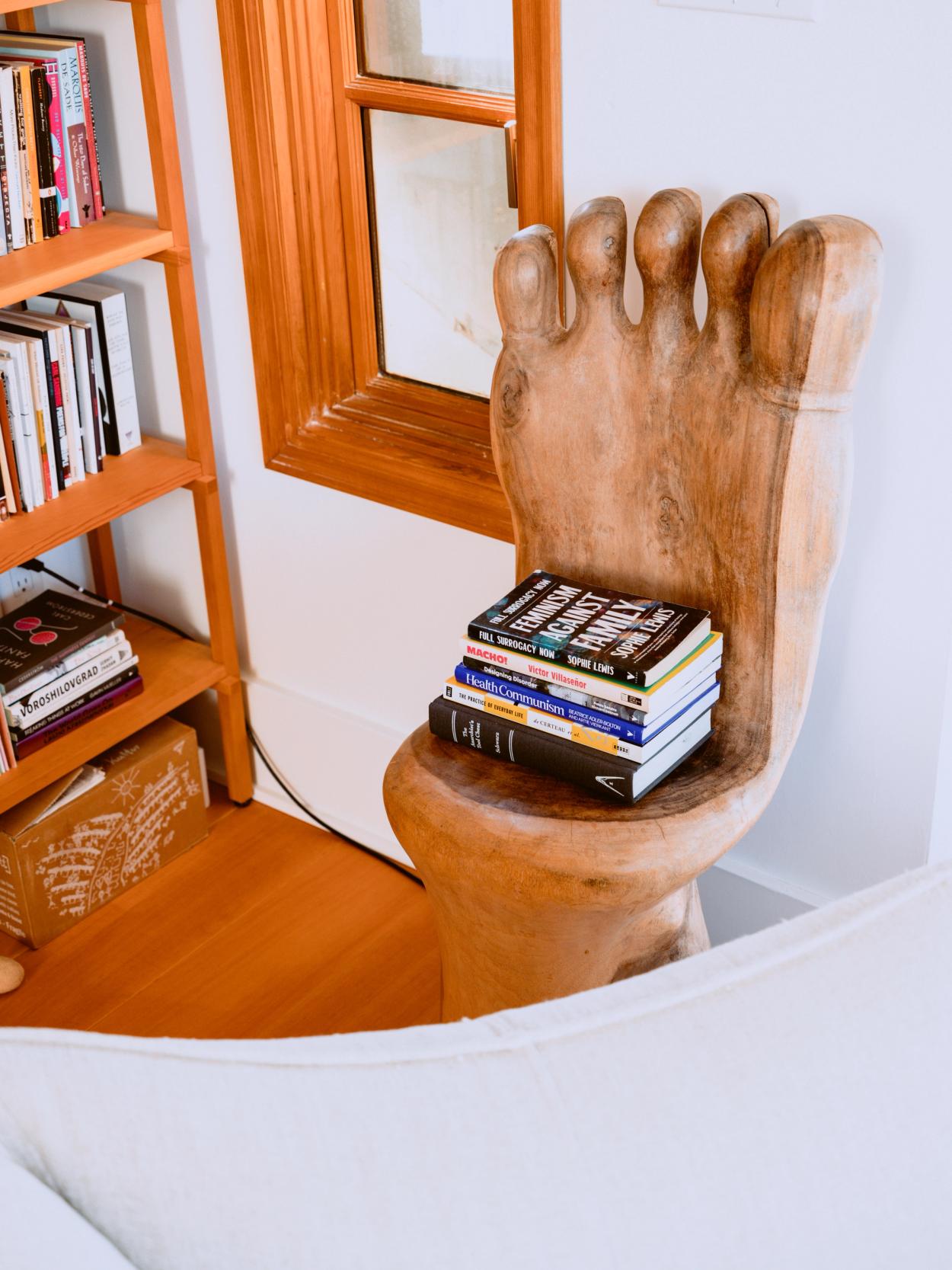
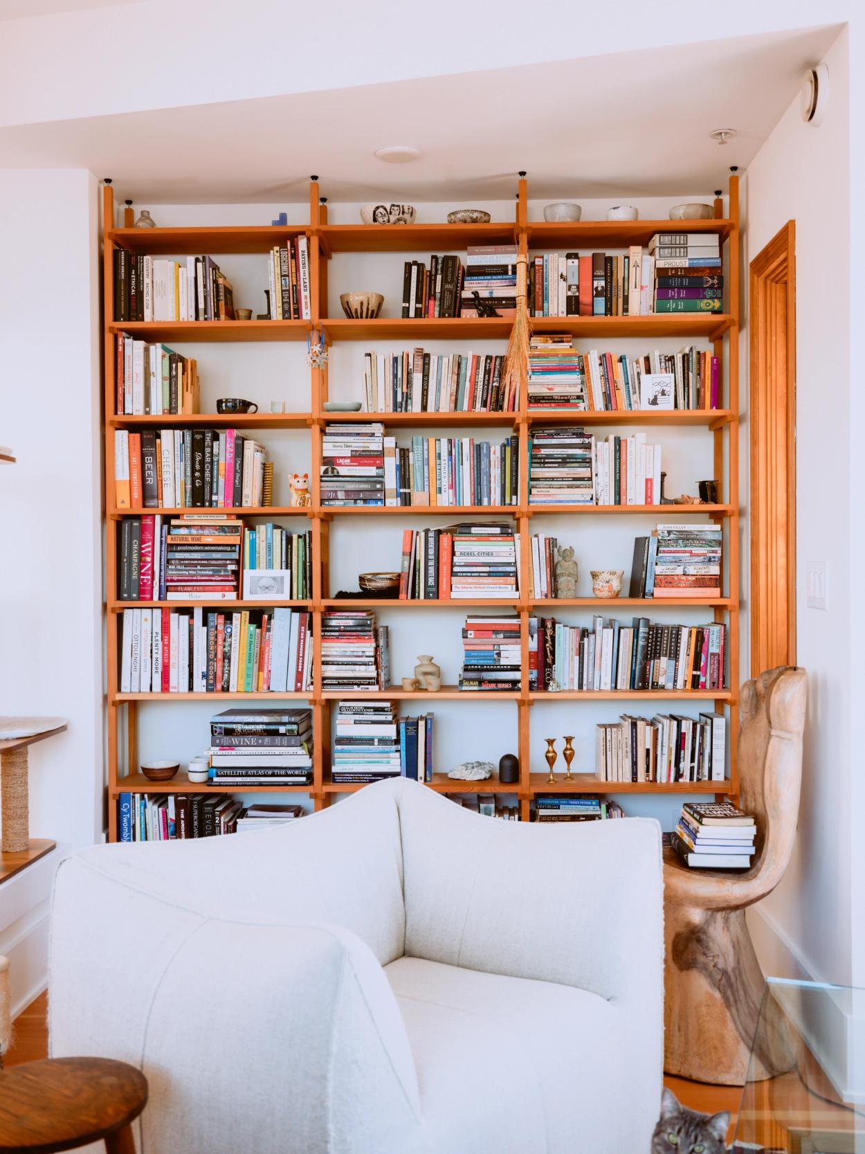
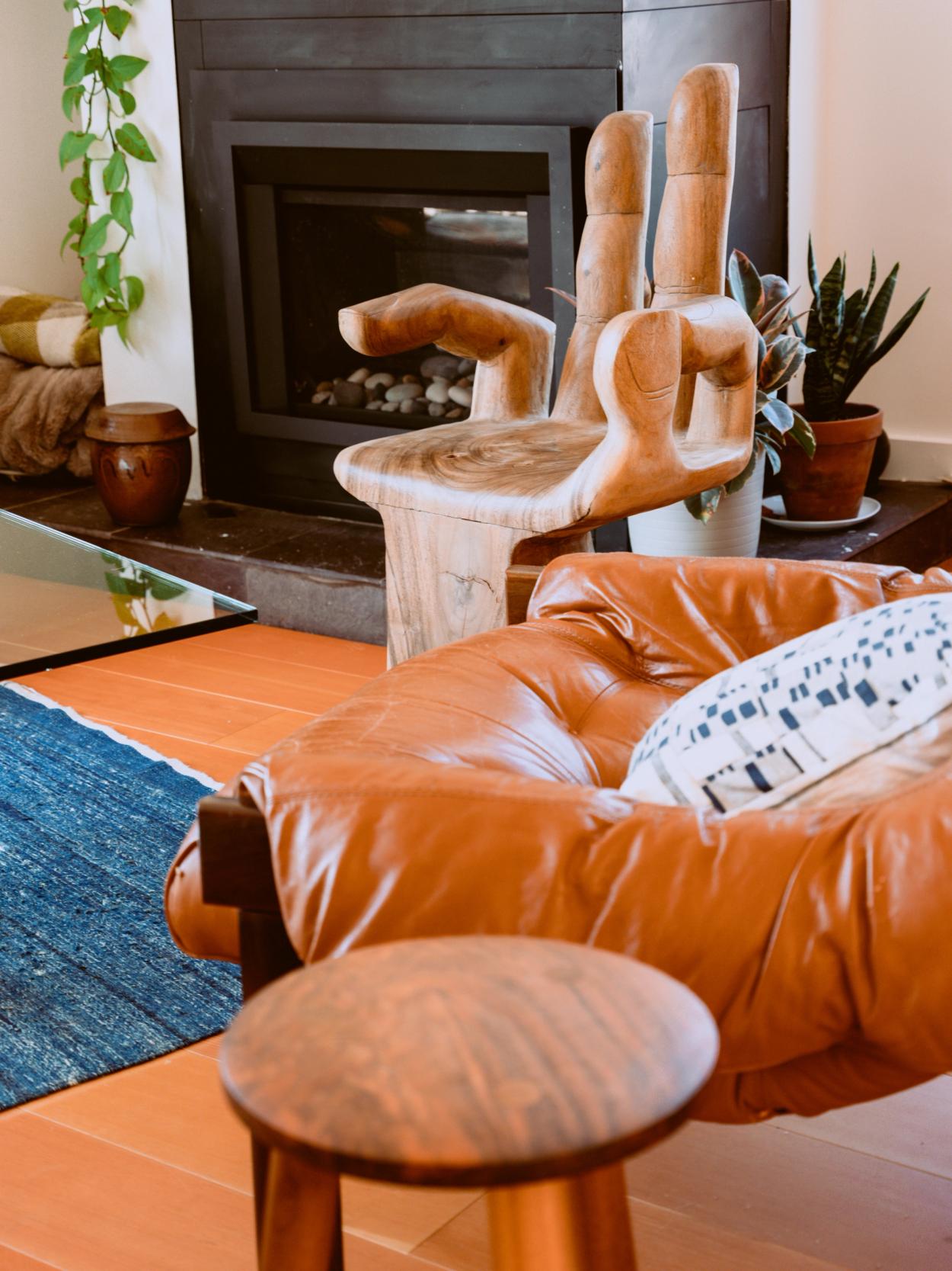
We are decidedly not minimalists, so what is important for us is creating moments to enjoy our objects and also ample space to shut things away that don’t need to be out all the time.
PC
Besides the kitchen, what other characteristics of the home are important to Ryley and yourself?
CS
We are decidedly not minimalists, so what is important for us is creating moments to enjoy our objects and also ample space to shut things away that don’t need to be out all the time. I don’t think having stuff needs to feel messy. The little collectibles, mugs, plants, and art on the walls are all artifacts that help make a home feel settled and your own. This notion is important to both of us.
From an architectural point of view, I think light is extremely important, but that doesn’t necessarily mean brightness all the time. For me, it is important to cultivate and frame the light on the north side of the house, the quiet side of the house. Our space has light from the south, west, and north with some clever south-side shading techniques, and that played into our decision to move here significantly.
PC
As your architecture practice grows, what kinds of projects would you like to take on?
CS
It is an interesting time for residential development, as there are lots of zoning changes being considered that would allow for modest density in a typical Vancouver residential area. If this motion passes, I would love to do small multi-family projects in residential zones in Vancouver, more rural homes, and definitely a restaurant here and there for like-minded people.

View from Claire's rooftop overlooking the Gastown railroad tracks
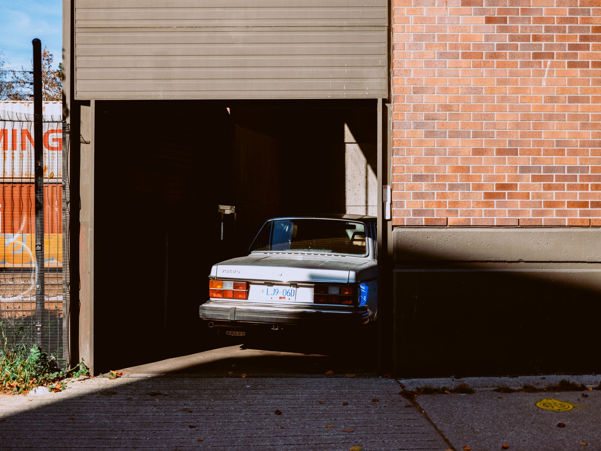
Claire's trusty Volvo
Words: Patrick Campbell
Photography: Guy Ferguson, Patrick Campbell
Thanks again to Claire for taking the time to sit down and talk with us, and we wish her all the best of luck as she closes in on her architect designation.
