Building Culture: DOI and Christopher Boyd in conversation with Mark Ritchie
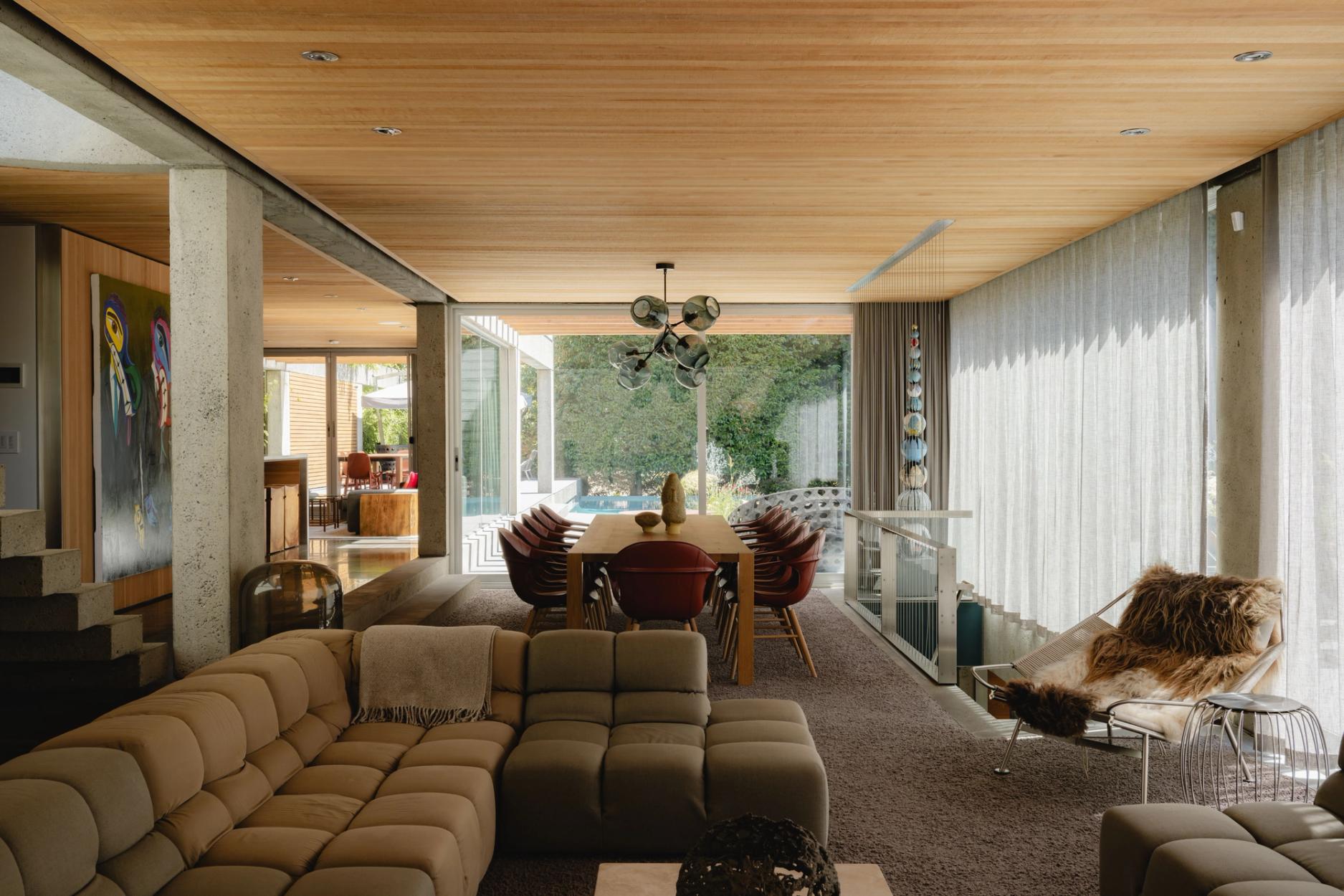
Cranley Residence by ABC. Photograph Patrick Campbell
DOI co-founders Patrick Campbell and Alex Nelson, with colleague Christopher Boyd, sit down with Mark Ritchie, co-founder and principal at Architecture Building Culture, to discuss his practice and some of the challenges and opportunities designing and building homes in BC.
Alex Nelson
Thanks for sitting down with us, Mark. I first came across your work through Patrick. He had added your practice to the DOI Directory. I think it was this house I saw first actually (we’re sitting in Mark’s West Vancouver home). I was really intrigued by the name of the practice, Architecture Building Culture. Where did that come from? What does that mean to you?
Mark Ritchie
It was a phrase that was bandied around when I was living in New Zealand. I had my own practice Mark Ritchie Architecture and I worked with a young academic at the time. We were both teaching at Victoria University of Wellington. I was teaching interiors and he was teaching architecture. He used to often talk about architecture as building culture. It kind of stuck as a phrase. The idea that architecture is a process of building a given culture, through the making buildings. So, it became our name. The acronym ABC has become a more common way of referring to us because the full name is a bit of a mouthful. Names are a tricky thing, aren't they? Because they have these histories.
AN
I think it's intriguing. It signals a little bit about how you think about the practice.
MR
I do like what it can mean, the idea that culture is what we're trying to add value to, whether it's a family's culture, a business culture, or an institutional one. You're trying to make a positive contribution to that culture, using architecture as the instrument. It really is at the core of the work for example when you first meet a couple to talk about a house for them, you're trying to understand how they live, what their values are and what their future could be and then how do we address that through architecture.
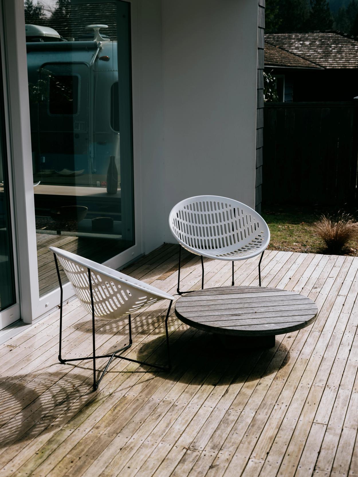
Cranley Residence by ABC. Photograph Patrick Campbell
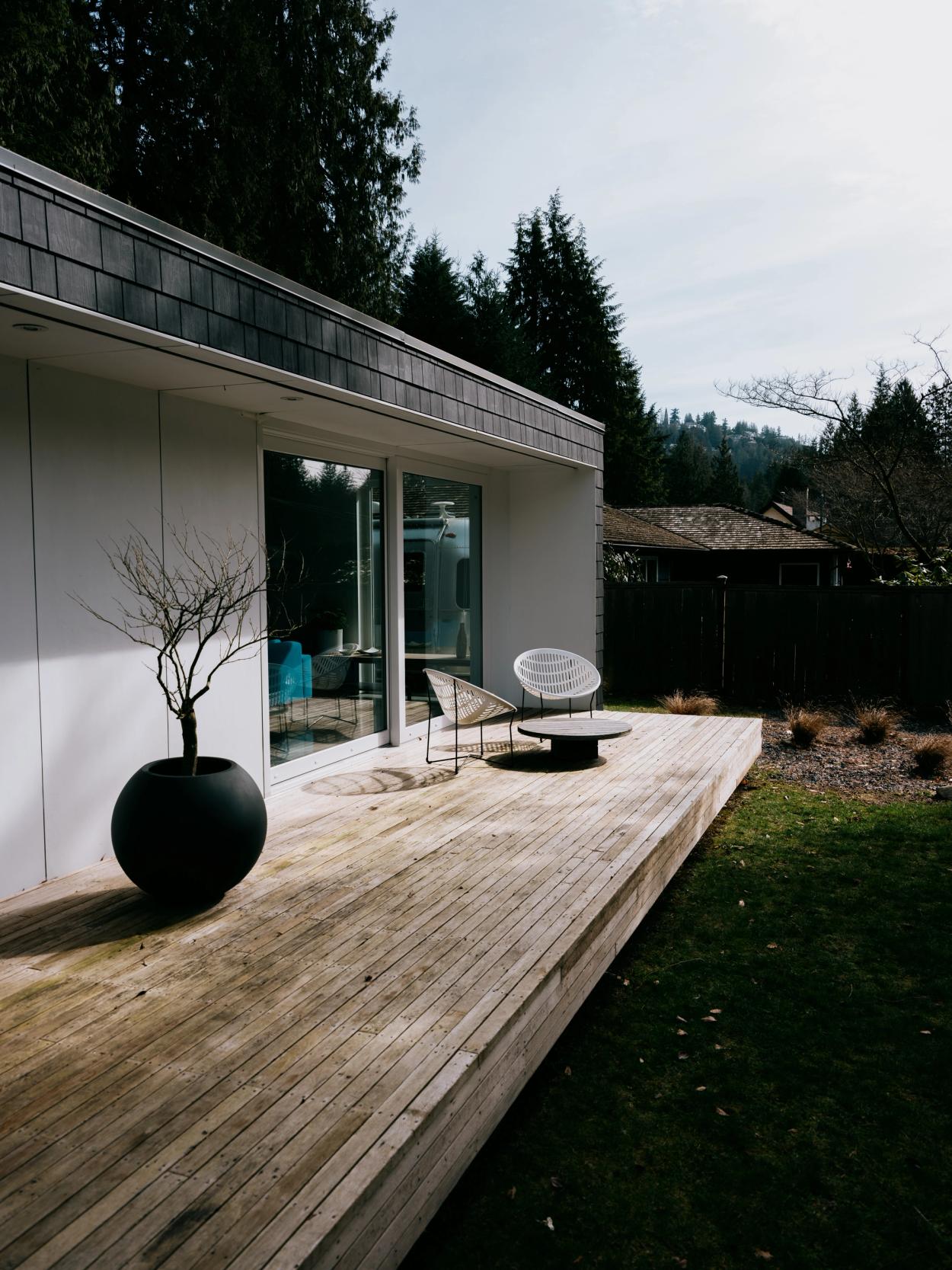
Cranley Residence by ABC. Photograph Patrick Campbell
AN
I also find the name interesting because in architecture and other creative fields, like graphic design and advertising, it's common to use the names of partners or individuals. However, the reality is that the work is rarely the effort of just one person; it's a collective effort involving a whole team. By opting for a name that isn't tied to a specific individual, it opens up the idea of authorship to reflect the collaborative nature of the work being produced.
MR
That was intentional. Yes, we wanted no personal names for that reason. We want to work with the best ideas no matter where they come from.
AN
Design by nature is a collaborative decision making process, isn't it? Clients, colleagues…
MR
...builders, suppliers and so on. On any given project, the number of ideas and decisions that get made is so vast, you could never maintain a record of it all They come from all directions. I suppose there's the captain of the ship analogy, where our task is to keep the ship going in the right direction. While all of the inputs, can either make it go faster, or sometimes swerve it off course. Our job is to get it back on course, especially working with clients that come up with ideas every day. Which I love! I'm happy to talk about ideas all day long. You just have to be mindful of whether or not the idea serves the overall goal of the project.
AN
Tell us about your transition from New Zealand to Vancouver. I'm curious about how this geographical shift influenced your practice.
MR
A lot of my experience in New Zealand translates quite directly. But some of it doesn't.
AN
Are there similarities?

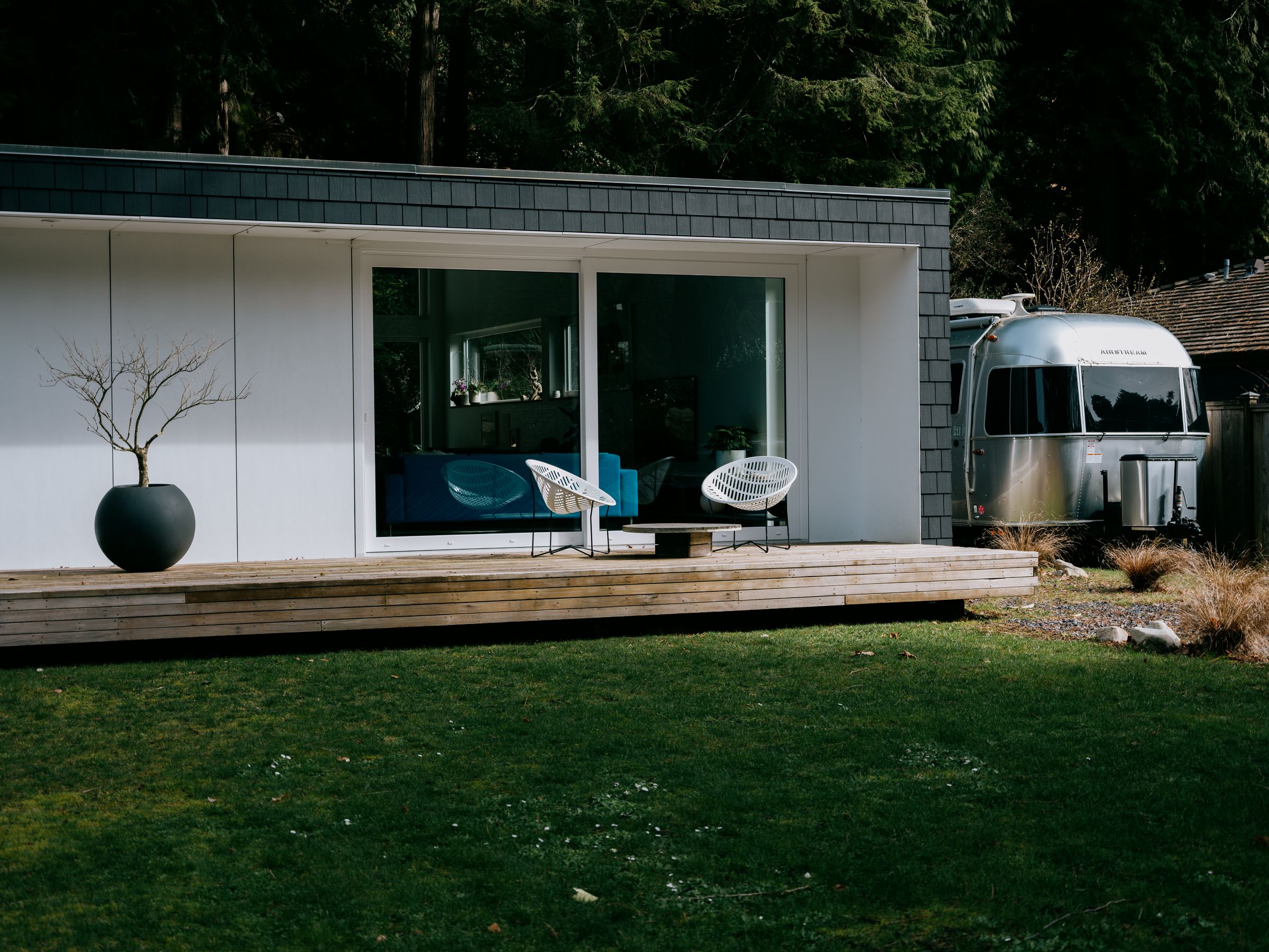
Howard Residence. Photograph by Conrad Brown.
MR
New Zealand is climatically more similar to Canada than Australia. A lot of Australia is hot and dry, and it doesn't rain in the same way. The thing that's taken me 15 years living in Canada to get my head around, is the kind of pressure the environment places on the envelope of a building and how carefully you have to manage that compared to somewhere like New Zealand. In New Zealand, storms, driving rain, and horizontal weather are challenging. It’s intense for short periods. Here in Vancouver Canada it's about extreme temperature differences and humidity and so on. But the other more architectural difference is the indoor-outdoor relationship. In New Zealand, and Australia, the doors can be open all summer. The boundary between indoor and outdoor is more ambiguous and a as a result, there's a lot of good architecture in New Zealand that explores that issue. So I thought, right, I'm going to do that in Canada but it didn’t translate directly. It's taken me a while to understand why. Part of it is about wildlife, but it's also deeper than that. It seems to be a cultural thing as well.
AN
I like this idea of coming to terms with environmental conditions and then making adjustments based on that. It seems to me that during the mid-century period, here in this region, there were some ideas imported from further south, California namely. There was that kind of friction between trying to do something stylistically from a different place, but that stylistic approach just didn’t have the ruggedness to withstand the conditions here.
Patrick Campbell
The engineering of a flat roof in the 1950s in Vancouver didn't work. And a lot of them leaked. You can't take a Neutra and put it in the Pacific Northwest. You can take some of those ideas, but if you do a direct copy… this is why we're having to restore all these houses again. They weren't built for this climate. California doesn't rain like it rains here.
MR
The other issue from that period is the structure piercing the envelope. A mid-century concept is that the interior structure projects outwards through the envelope. That's more difficult now as we try to create a complete air tight, insulated blanket around the structural system. If you want anything external to that, it is better to be attached. You rarely have the opportunity to manifest that lovely concept of a structure cantilevering out of an envelope. It's hard, especially with contemporary energy requirements.
AN
With respect to designing residences, what are you most excited or motivated by these days?
MR
Staying positive, despite the challenges. The tough part is the soaring costs of construction. We are constantly wrestling with budget limits, and often, we're left with just drywall and paint, which can feel a bit limiting. But, flipping that on its head, the question becomes, how can we still produce interesting architecture with less? I’m somewhat obsessed with making every square inch count through efficient planning. Creating spaces that are flexible and fully utilized, so there’s no wasted space, has always been a focus. I find designing within tight budgets quite motivating. It forces you to be resourceful and inventive. Sure, occasionally, we get clients with deeper pockets, but, being wasteful just doesn’t sit right under any circumstances. Plus, we’ve got to factor in more and more sustainability requirements, which adds cost. Every project is a new opportunity, especially with the variety of the sites in West Vancouver. Each client brings their own unique set of needs and desires, add to that constantly evolving bylaws and budget constraints, the result is a truly unique project every time. It’s these variables that keep the work fresh and exciting for me.

Howard Residence. Photograph by Conrad Brown.

Howard Residence. Photograph by Conrad Brown.
AN
It's a wonder anything gets done under such a mountain of constraints.
MR
They add to the creativity in a way. They can give you direction. An owner might have a fabulous painting they want to use in their new house. That might be the starting point.
AN
Looking back, were there any particular constraints that really shaped the design process for the Howard Residence?
MR
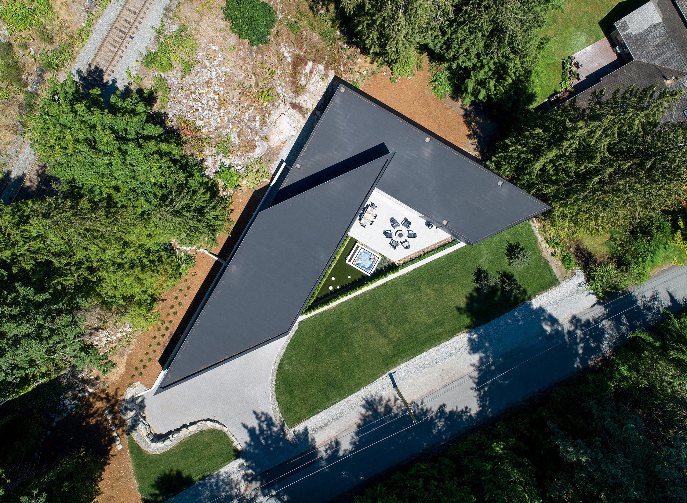
The challenge was all about the site. It's this big, triangular piece of land with a very long street frontage with the railway line above a rock face to the north. The outdoor area, shaped by the site's unique geometery, really became the heart of the home. With the house facing south, we focused on making the most of the available sunlight and figuring out how to balance privacy with the connection to the neighbourhood and street. It was about crafting this special outdoor space that then defines the whole project, while also considering how the house interacts with its surroundings.
AN
I’m curious about the massing of the house in general. It looks very much derived from the constraints of the site, like sort of maximizing what you can do with that space.
MR
The footprint of the home is almost a direct function of the setbacks. The buildable area was trianglar. We became excited about the potential in those extreme angles. For instance, in the main bedroom, utilizing a small balcony to address how one might use a sharply angled space. This challenge sparked an exploration of how angles and traditional shapes and volumes could interact. We spent a lot of time figuring out the atrium's role and how it could facilitate a dialouge between the various spaces and the courtyard. Every part of the house, whether it's the balcony, office, bedrooms, hallway, or the living room and kitchen, maintains a connection to this central space, creating a cohesive yet dynamic series of relationships throughout the home.
AN
I’m curious how you were thinking about vertical space and the levels within the house?
MR
The concept of the crow's nest office was the owner's idea. Positioned above the kitchen and entry, it provided a unique, open double height space, which we embraced in the design. I'm curious about how future occupants will utilize this upper level. Originally, we planned a guest room in the large space to the west, complete with a window facing the rock, alongside a spare room and storage area. However, the decision to keep this space open transformed it into a vast playroom for the children, which they seemed to enjoy. Despite its unconventional layout, the arrangement has proven to be effective. Observing how people adapt to and inhabit the spaces we create is incredibly insightful and valuable for architects.
PC
Where did the decision to place the primary bedroom along the street come from. Traditionally, one might expect more privacy and seclusion, especially for a the parents, which would ideally be situated away from the street and closer to the natural rock backdrop, considering its size.
MR
The decision was driven by the family's desire to stay close to their children, especially with a newborn. They wanted the baby, and eventually the kids, to be close by during their younger years, which influenced the placement of the bedrooms.
Christopher Boyd
I've noticed architectural designs where the entryway has a lower ceiling that opens up into a larger living space. The Howard House seems to follow a similar concept but in reverse, with most of the house on a single level and the bedroom wing a step down. Was this a deliberate design choice or dictated by the landscape?
MR
It was a deliberate decision, though it presented structural challenges. We aimed for a design where two volumes appeared somewhat independent, which resulted in an eight-foot ceiling for the living room. While lower ceilings are not always preferred, we believed this height would enhance the connection to the natural surroundings, much like in modernist period architecture where the focus is often outward to the exterior. This approach sometimes requires clients to adjust their expectations, as some insist on higher ceilings. this project was about embracing the views and allowing the spatial dynamics to intensify that experience. It points to the importance of varying spatial experiences within a building to avoid monotony and to create a series of different moods and feelings.

Howard Residence. Photograph by Conrad Brown.
CB
I have to think that as you go to bed at night, there's a descent from one level to the next. I think that probably plays on the psyche a little bit.
MR
It could be. The ceiling stays level, so we had a higher ceiling in the bedroom, so it's kind of the reverse of what you might expect.
AN
That view out onto the forest, it's cinematic. The windows are almost like an anamorphic frame.
MR
In this environment, we're lucky because we get those opportunities. In most urban environments, you're rarely looking out at pure forest. This house is not about a view of the ocean, it's all about a view of the forest. That's what we were trying to exploit. I think it is interesting that in place like Winnipeg where there is no mountain, forest or ocean views, there is a great architectural tradition where the built environment is often the primary view. I suspect it is not a coincidence.
PC
Who would have thought that Winnipeg would have been our Mecca for brutalist concrete work? It's kind of like Columbus in the US is home to so much great modern architecture.
AN
Columbus, Indiana, right?
PC
Yeah.
MR
I should check it out.
PC
What attracted you to architecture in the first place?

Howard Residence. Photograph by Conrad Brown.

Howard Residence. Photograph by Conrad Brown.
MR
I didn't really know what architecture was when I got into it, which I think is a common experience. At first, I thought it was all about artistry and drawing, which suited me because I was ok at drawing and painting. But as I've taught and seen many students' work over the years, I've learned that being good at drawing isn't crucial for being a good architect. Once I was in architecture school, it became clear to me that the most successful students were those who could think conceptually, often those with more life experience or a background in another field. It seemed that having a broader perspective, or even a completely different skill set, could be an advantage, as long as you were willing to think more openly and conceptually. It comes down to how you think as a designer, whether in graphics, industrial design, landscaping, or interiors; it's about applying that design thinking to architecture.
PC
Were there any architects you looked up to as you got further into your studies?
MR
Back in the 80s, when I was in architecture school, everyone was talking about Gehry and Morphosis. We were right in the middle of this deconstructivist wave, where traditional forms were being dissected and reimagined. It was an exciting time, but also a bit confusing. We were questioning where architecture was headed, especially as the postmodern era started to feel outdated, even humorous to some. That's when I began gravitating towards the modernists. I had the opportunity to work with Kerry Hill in Singapore, which was a pivotal experience. I began to appreciate architects like Louis Kahn and, later on, David Chipperfield—those who respected modernist principles but sought to adapt them to contemporary life and future challenges. It was about looking forward while honouring the past,
AN
Custom residences are an expensive thing for the average person. Do you think it's possible for custom architecture to be more accessible?
MR
That’s a really great question, and honestly, there’s no straightforward answer. Back in New Zealand, it’s pretty common for people to hire an architect for even small projects, without necessarily having a big budget. Here there seems to be more of a DIY spirit and developers play a significant role. We’re currently working with one, which is exciting, but admittedly, those projects aren’t going to be what you’d call affordable. That said, we’ve had some success with making architecture more accessible in the U.S., doing projects at around 200 U.S. dollars per square foot (a few years ago now) that qualify as affordable housing. Down there there are some interesting public grants available to developers that make it possible to hire architects and create well-designed, yet financially attainable housing. So, perhaps the support systems for affordable projects are more developed in the U.S.
CB
They have access to trades that haven't gone ballistic.
MR
Indeed, design is essentially a tool for crafting viable solutions within any set of constraints, including low budgets or the need for affordable housing. The goal is to find a designer who can deliver an effective solution, with fees adjusted to fit the project's scope. There are also creative ways to manage compensation, for example a developer in Portland, Oregon, offered us a stake in the project instead of a full upfront fee, introducing a risk-reward element into the equation. The situation is particularly challenging in areas with high land values. The introduction of Vancouver's new infill rules could open up possibilities, such as developing four units on a single lot, allowing for more inventive approaches. These regulations could lead to more competitive fees and cost-effective solutions, provided there's the capability to embrace such opportunities. The push towards greater density can be beneficial for the city as it promotes more efficient and creative use of the urban landscape.
